Quick Tip: InDesign out of order

I wanted to create a PDF of some pages in an InDesign document, but I needed them in a different order in the exported PDF — page three followed by page two. I know, weird. So I was going to make the PDF and then rearrange the pages in Acrobat.

But as I was exporting the PDF, I wondered what would happen if I typed exactly what I wanted in the page range field. I typed “3,2” and hit the export button expecting an error message…

Magically, my PDF outputted correctly with page three first, followed by page two. Mind. Blown.

To export these in order, type "2-4, 1" in the page range field and the exported PDF will be in the correct reading order.

To export these in order, type "2-4, 1" in the page range field and the exported PDF will be in the correct reading order.

Turns out the range field has other tricks, too. I tried “3,2,4,3,2” expecting it to give me an error message. Nope. The resulting PDF had all five pages, in that order… including the multiple pages.

The most practical use for this little trick is when you’ve set up a brochure with the back cover and front cover on the same spread and want to export the pages in the order a viewer will see them. Typically page 4 is first, followed by 1-3. So type “2-4, 1” in the page range field and the PDF will export in the correct reading order. 

It’s a nice touch. And I had no idea the feature was there.

Making Quick Apply useful in InDesign

Years ago, Adobe added a “Quick Apply” feature to InDesign. I have no idea when, but it’s been awhile. 

Quick Apply opens a window with all sorts of selections in it. You activate Quick Apply by clicking on the (very prominent) lightning bolt in the command palette, or by using the keystroke Command + Return. By default, it includes all your style sheets, menu commands and more. And you can search the options… it kind of tries to be Spotlight search for InDesign.

I saw it demonstrated, checked it out and had absolutely no use for it. I never used it again.

But the other day, I accidentally activated it and started to check it out again. And it’s a little more useful than I first thought.

In the top of the bar is an arrow that lets you select what is shown in the Quick Apply window. By default, there are too many options to be helpful, but by customizing what shows up, it becomes more useful. I turned everything off except the style sheets. Now I can select some text or an object, hit Command + Return and apply a character, paragraph or object style.

(I’m not sure why you would want menu commands to come up in the Quick Apply window. Yes, you can search them, but there are so many, it’s tough to get a helpful result.)

Quick Apply might save a little bit of time, but for me, the real benefit is for users with smaller screens. Using Quick Apply, you can apply any style sheet without having a bunch of palettes open. Should reduce clutter and be a real space saver.

Every Wednesday, I post an quick tip for an Adobe app.

Color themes in Creative Cloud

Years ago, Adobe introduced Kuler, a tool for selecting colors and groups of colors. I always enjoyed playing with it, although I rarely exported the palette I created and imported it into an Adobe app.

Kuler is now Color CC and is still available as an online tool. But Color CC is incorporated throughout Creative Cloud as Adobe Color Themes:

  • InDesign: Create themes with InDesign with the Adobe Color Theme palette.
  • Photoshop: Open the palette by going to Window > Extensions > Adobe Color Theme.
  • Illustrator: You can't create new palettes, but you can access color palettes that you've saved to your cloud account. There is a link to the online tool from the Adobe Color Theme palette.
  • Capture CC: A mobile app that let's you create color palettes on the go and share them with your other CC apps. Building a color palette from a picture is actually really cool. 

Integrating Color CC throughout the ecosystem is just another way Adobe is merging their online tools, applications and cloud experiences. They are slowly adding more and more value to the subscription.

Every Wednesday, I post a quick tip on an Adobe app.

The Color Theme palette in Indesign CC 2015

The Color Theme palette in Indesign CC 2015


* The Capture CC app replaces the older Color CC app and includes more than just color features. But we'll save that for another tip.

Spaced out (correctly)

Let's say you've got some words that you want to spread out evenly across a page in InDesign. I've seen this done a bunch of different ways — and most are completely inefficient. Here's the easiest way I know to do it:

You have a list of locations (A). Here I've used names of cities in South Carolina. Type them out with one space between each word and then "justify all lines." The words will now be stretched out across the entire text box (B), evenly spaced. And as a bonus, it's easy to edit if necessary.

But what if instead of four single words, you have grouping of words. Here I've added "Mt. Pleasant" and "Myrtle Beach" to my list of South Carolina cities (C). If you simply justify them, the words all space out as expected. (D)

But you want the city names to stay together, so what do you do? Replace the normal space with a fixed width, non-breaking space and keep the word groupings together. Go to "Type > Insert White Space > Non-Breaking Space (Fixed Width)" to place the special character. If you add the fixed width space to "Mt. Pleasant" and "Myrtle Beach," InDesign will ignore the space in the middle and treat the word pairs as single words (E).

It's a simple tip, but a time saver if you ever tried to build something like this with tabs, or god forbid, separate text boxes.

Every Wednesday, I'll post an tip for an Adobe app.

The definitive guide to rounding corners in InDesign CC 2015

Over the last two weeks, a 2010 post of mine on rounding corners has suddenly become very popular.* I wrote it for CS4 and posted an updated version for CS5. But I wanted to revisit the tip and update it for Creative Cloud 2015.

The process for rounding corners is actually more complicated than I expected and is different depending on what shape you are working with.


Rounding corners on a square or rectangle

Rounding the corners** on a rectangle is straightforward and there are actually a couple of ways to do it.

The yellow box method: When you click on a rectangle with the selection tool, a yellow box appears near the upper right hand corner. Click the yellow box and diamonds appear at the corners. Drag the corners inward to round the corners equally.

To round only one corner, click the yellow box and then, while holding down shift, click and drag on the corner you want to modify.

(1) Click the yellow box in the upper right hand corner to edit the corners. (2) Drag the diamonds to change the amount of the corner effect. (3) Hold the shift Key to change only one corner.

(1) Click the yellow box in the upper right hand corner to edit the corners. (2) Drag the diamonds to change the amount of the corner effect. (3) Hold the shift Key to change only one corner.

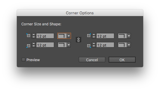
The dialog box method: If you prefer a little more precision, you can go to Object > Corner Options… and set the rounded corner to a specific value. And it’s easy to round one corner.

Set the amount and style of your corner effects with the corner options dialog box. Uncheck the chain icon to set corners independently.

Set the amount and style of your corner effects with the corner options dialog box. Uncheck the chain icon to set corners independently.

The control palette method: You can set a rounded corner value for all four corners in the control palette.

The corner controls are easy to find... It's the only icon in the Control Palette with blue dots.


Rounding all corners on polygons that are not squares or rectangles

So rounding corners on rectangles is easy, but what if you don’t have a rectangle. It’s still easy, but different.

The yellow box method: Doesn't work. The yellow box appears only for rectangles. Triangle, trapezoid, hexagon… no yellow box.

The dialog box method: Works just like it does for the rectangle with one, major exception. You can’t round individual corners.  All of the corners have to be exactly the same.

Try to change the corner size or shape on a shape other than a rectangle and all but one input field is faded out.

Try to change the corner size or shape on a shape other than a rectangle and all but one input field is faded out.

The control palette method: Exactly the same as the rectangle method, with no control over individual corners.


Rounding individual corners on a polygon

So let’s say I want to round selected corners on any polygon. None of the normal methods will work, but thankfully, Adobe provides a script for this.

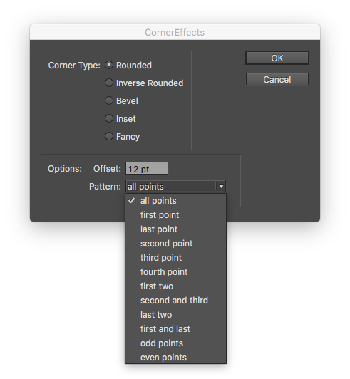
The scripting panel (Window > Utilities > Scripts) contains an Application folder with sample scripts in Applescript and Javascript. Select the “CornerEffects.applescript” or “CornerEffects.jsx.”

The top part of the dialog box essentially provides the same options as the “Corner Options” dialog box. And the offset box allows you to adjust the size of the corner. The Pattern combo box defaults to “all points,” but take a look at the options available: first point, last point, second point, third point, odd points, even points and more…

When applied to a box, it gives you the ability to round or bevel selected corners. Sometimes, it takes a little trial and error to figure out which point the “first” point is. The first point usually seems to be point in the upper left and then selection moves counterclockwise. 

Pretty much the only way to make these shapes in InDesign is with the Corner Effects Script.

Pretty much the only way to make these shapes in InDesign is with the Corner Effects Script.

You can also use the odd and even points patterns on a star shape. “Odd points” effect the inside points. “Even points” modify the outside points.

That should help you round any corner you need. As an aside, Adobe Illustrator has a completely different and superior corner rounding process. Personally, I hope that Adobe adopts the Illustrator method in InDesign.

Every Wednesday, I post a tip for an Adobe app.


* Google works in mysterious ways.

** You can do more than just round corners. You can bevel them or create several different effects. But most people just want to round them.

Checking out the library

Adobe added a new* library feature across all of Creative Cloud. It’s easy to use and I think it will become a really integral part of design workflow in the Adobe world.

A library of random Sketchbook B assets.

A library of random Sketchbook B assets.

At first, the library appears to be just another palette in the vast forest of palettes. But it's easy to add images, color palettes, style sheets and more to the new library via drag and drop or by clicking the icons at the bottom of the palette.

Library assets are then accessible from most Adobe desktop and mobile apps.** Drag a logo into your library in Illustrator... place it in InDesign or Photoshop.

It's also an integral part of Adobe's vision for how mobile devices fit into the design environment – an easy way to share assets between different types of devices. For example, Adobe Comp CC, a mobile layout app, uses your library to pull appropriate graphics, stylesheets and color palettes, on your phone or tablet. Even if those graphics were created in InDesign or Illustrator.

Try it out. You might find that it's a useful feature to have if you have a client library that you need to share between apps or designers.

Every Wednesday, I publish a quick tip for an Adobe app.


* I remember a similar feature in Quark Xpress years ago. But the benefit of the new library is how you can access it from any Adobe app.

** It looks like other, non-Adobe apps can access the library, too. But I don't think anyone supports it yet.

That one weird little InDesign printing trick...

I was digging through InDesign CC 2015 looking for new features and found a quick little printing trick that, it turns out, was also in CC 2014.* 

Ever want to just print the spread that you are working on? Instead of going to File > Print... and trying to remember what page is selected, just go to Layout > Pages > Print Spread... The print dialog box will open with the printing range set to the spread you are working on.

A nice little feature that I had no idea was there…

* And honestly, maybe it's been there forever. I really don't know.

InDesign CC 2015: Paragraph Shading

Adobe has released the 2015 version of Creative Cloud. And that, of course, brings new versions of InDesign, Illustrator and Photoshop. Lots of blogs are covering the headline features, but I often find that the small improvements often impact my workflow the most. I’m still exploring the applications, but figured I'd start posting new features as I discover them.

The first one in InDesign that jumped out at me is paragraph shading. You can now apply shading to any paragraph… so no more drawing a color block behind a block of text you want to highlight.

The blue box is created using paragraph shading. Here, I've ALSO inset the paragraph margins.

The blue box is created using paragraph shading. Here, I've ALSO inset the paragraph margins.

A couple of obvious advantages to this:

  • If you want to shade a paragraph within a long block of text, it will move and resize automatically as you make changes.
  • It can be completely controlled and modified through style sheets, making it infinitely more powerful.

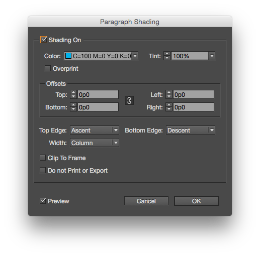
You can apply basic paragraph shading from the Control Palette or Paragraph Palette, but to gain full control, select “Paragraph Shading…” from the flyout menu on the Paragraph palette. The dialog box provides options to use a tint, set an offset and control how the shading is applied.

The full paragraph shading dialog box offers more options.

The full paragraph shading dialog box offers more options.

There is also an option for “Do not Print or Export*,” which is pretty cool if you want to highlight a passage that needs to be updated, but don’t want it to print. (I often set text that needs to be updated in 100% magenta. Now I have the option to shade it…)

* Not sure about the capitalization here, Adobe...

Unexpected troubleshooting help

I was trying to get some materials printed yesterday at the office and InDesign was repeatedly crashing shortly after I hit print. 

I usually ignore the "Crash Report" dialog box. No offense to Adobe, because I ignore them from Microsoft and Apple, too.* But I was on a deadline and I was irritated and so I typed "Trying to print" in the text field and hit "Send Report." I started to reopen InDesign.

I didn't notice the checkbox to "Allow Adobe to suggest a solution or work around." But then, another message popped up: "Adobe has found a solution or workaround for the recent crash in Adobe InDesign CC 2014. Please click here for further details."

Screen Shot 2014-10-22 at 9.00.21 AM.png

I'll be honest, I was so floored, that I didn't take a screen shot or really read it too carefully. (I had to recreate to crash to get the above screenshots.) I clicked the link which took me to "InDesign & Illustrator | Crash while printing to Fiery RIP." Which, by the way, was exactly the solution to my problem.

I'm guessing the error code pointed exactly to the issue with the Fiery. I have no idea if Adobe provides this kind of troubleshooting help for other known issues. I've never seen it before. I'm guessing this feature was added in a recent version on Creative Cloud. But it was helpful, and I really had no idea that Adobe** could even respond in that way.

So today's quick tip is "Don't ignore the crash report dialog box." You never know when you'll get unexpected troubleshooting help.

Every Wednesday, I post a tip on an Adobe app.

* A random note: I will fill crash reports out for small developers. I guess I think my data will mean more to them since they have a smaller installed base.

** Or that any company could automatically respond to a crash report. I really just assume that all troubleshooting info goes into some giant automated database that no one looks at...

QR Codes in InDesign

InDesign will let you create a QR codes without leaving the application. Go to Object > Generate QR code... You'll have options for hyperlink, text message, email, business card or plain text. 

Once you have all the information filled out, you can then place the QR code like you would an image.

I will freely admit that I tend to avoid QR codes like the plague. I'm not convinced of their effectiveness. But sometimes, you need to use one and generating one without leaving InDesign is helpful.

Every Wednesday, I post a quick tip for an Adobe app.

Follow the leader

Most people don't know how to use tabs properly. But tabs can be really powerful, especially if you are building a form or table of contents.

Below you see a simple form with the tab ruler above it. Select each tab and type an underscore in the "Leader" box. Whatever character you type in the "Leader" box will repeat all the way to the tab. The underscore becomes the lines on the form. Much quicker and more accurate than trying to draw the underlines yourself. And much, much easier to edit the form later.

Screen Shot 2014-09-14 at 10.04.58 PM.png

If you are building a table of contents, you may want to have a dotted line from the end of the chapter name to the page number. Don't type a bunch of periods! Just set the "Leader" to a period. You can also use a right-justified tab to line up all your numbers correctly. Faster to build. Faster to edit.

Screen Shot 2014-09-14 at 10.07.09 PM.png

Does anyone still use TIFF files?

Does anyone still use TIFF (TIF/.tif) files? And if so, why? Back when I was a young designer, a TIFF file was the only real choice for exporting a high quality image. But I can't really imagine why anyone would use one in today's Adobe/Creative Cloud workflow.

InDesign's support for directly placing native files – Photoshop, Illustrator, PDF and even other InDesign files – largely eliminates the need to export to another file before placing. (Although I still save logos as EPS files when they are final.) Many people don't know that InDesign has the capability to place native files or assume that it will cause significant problems in production.

For high quality, high resolution images, you can place a Photoshop file (PSD) directly into InDesign. This way you place the original image and you aren't exporting a new TIF with each revision. One major benefit is that the PSD maintains all transparency when placed into InDesign. The only drawback I see here is that file size might get unwieldy if it's a large image with a bunch of layers.

If you are sharing a high resolution image, a JPG will work fine. Many designers turn their nose up at JPGs because they associate them with low resolution, highly compressed web images. But a high quality JPG doesn't have noticeable artifacts from compression and is much smaller than a TIFF.

Greyscale and bitmap files might be the only remaining use for a TIFF. When placed into InDesign, a greyscale or bitmap TIFF can be colored. So if you are wanted to colorize a grayscale image with a spot color, a TIFF is still your best option. But as 2-color print jobs become less common, I rarely use this technique for anything except screen printing.

Every Wednesday – and sometimes Thursday morning – I post a quick tip for working in an Adobe app.

Quark did one thing right...

There isn't much I miss about Quark Xpress, but I did prefer the way Quark handled text wrap.

In both apps, you select an object and set the text wrap. By default, InDesign applies the text wrap to all objects, regardless of whether the object is on the top or bottom. Quark only applied text wrap to text frames underneath the text wrap.

To turn on Quark-style text wrap in InDesign, go to InDesign > Preferences > Composition... and select "Text Wrap Only Affects Text Beneath." Now text wrap will only impact the frames underneath.

Highlighting bad lines

InDesign can highlight lines of text that are spaced badly. By default, the highlighting is turned off for justification issues. To turn it on, go to InDesign > Preferences > Composition... The highlighting options are at the top of the window:

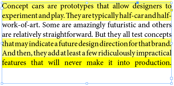
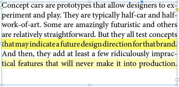
Turning on "H&J Violations" will highlight in yellow any place where InDesign can't meet your hyphenation and justification settings. Here's an example of a block of justified text with hyphenation turned off:

The worse the violation, the darker the yellow highlight is. Here is the same passage with hyphenation turned on:

Obviously, allowing InDesign to hyphenate and handle the bad breaks results in much better spacing.

I try to avoid full justification because of the issues that almost always come up with the spacing. But sometimes, you have to justify. And when you do, it's easier to spot and fix badly spaced lines with the highlighting turned on.

Every Wednesday, I post a tip on using an Adobe app.