Reintroducing Power Grid and Intermodal
A couple of old typefaces get new versions
Read More
A couple of old typefaces get new versions
Read MoreBold, angular and flexible
Read MoreNew, flexible type technology
Read MoreMy ode to science fiction bureaucracy.
Read MoreSharp-edged, modular unicase typeface designed on Fontstruct
Read MoreIntroducing SbB Danceflr, a chunky, bold and fun typeface
Read MoreI love concepts cars and modular type, so Honda’s Urban EV is right up my alley.
Read MoreMy odd entry for the Fontstruct Reverse Competition.
Read MoreMy new experimental unicase typeface, SbB Runabout Superwide, was named a Fontstruct Top Pick. I'm really excited about how it's turned out. Or to be more accurate, is turning out... It's still very much a work in progress. My intent is to use Runabout as the foundation of a whole series of fonts — with a range of widths, weights and designs.


I’m always a fan of Typographica’s Year in Review. Each year, they assemble a panel of experts who select amazing type that debuted in the previous year. And while I’ve seen many of the designs throughout the year, I always find more than a few typefaces that I missed.
The 2015 edition continues the tradition of excellence and offers up a wide variety of designs. Stuff you don’t see highlighted elsewhere. Each selection has an accompanying essay to give context to why the piece was included.
Among my favorites:
If you love type, do yourself a favor and take a look at the entire selection.
I started working on some sketches for a new typeface design and moved over to Fontstruct to prototype. I really like the way the prototype turned out, even if it looks virtually nothing like my sketches.
I’ve released two designs over on Fontstruct: SbB Runabout and SbB Runabout Superwide. They are free to download with a Fonstruct account.*
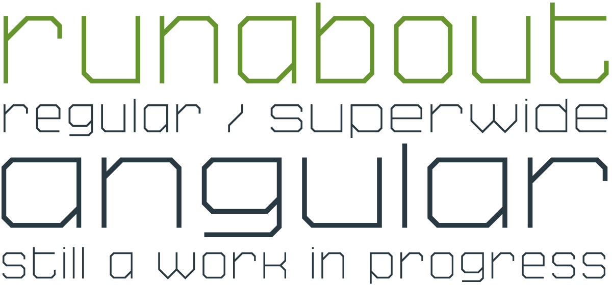
A couple of notes about Runabout:
* You can see and download all my published Fontstruct designs on the Sketchbook B Fontstruction page.
I’ve long been a fan of the Eric Gill’s designs.* I worked at a company for a few years were Gill Sans was one of the typefaces in the corporate identity. And I later designed an annual report entirely in Joanna. His book, An Essay on Typography, is an interesting look at typography during the industrial revolution and is a great read if you are interested in historical models for typesetting.
Monotype has released new, expanded versions of Gill’s most well known designs. More weights and versions make these designs better fits for modern identity systems.
Gill Sans Nova adds a number of weights and widths without losing the charm of Gill Sans. And it keeps the wackiness of the heavier weights – which I think is a good thing despite the fact that I still hate the lower case, ultra bold i. New alternate characters are a great addition and display versions add inline, shadow and deco versions that look sharp and playful.
But Joanna Nova gets the most attention and is the most impressive part of this release.** Previously limited to three weights — light, roman and bold, Joanna now boasts 10 weights. The italic versions are beautiful, too. And add to that a new sans serif — Joanna Sans — to serve as a companion.
With all this depth and complexity, I think it’s a matter of time before we start to see Joanna used in new identity systems everywhere. Each of the families is $99 for limited time, or you can spend $199 for the entire Eric Gill Collection.
Monotype has a site for the release that lets you look at everything in detail.
* I’ve long been a fan of Eric Gill’s designs, but not a fan of Eric Gill himself. We wasn’t a good man at all.
** I might be biased. Joanna has always been one of my favorite fonts and most people don’t know about it. Joanna has always been my favorite "best typeface you've never heard of" recommendation to young designers.
I’ve been fascinated by stenciled type for a while. Stencils started as a practical necessity – an easy and utilitarian way to reproduce type. But the use of stencils has evolved and is now visually representative of industry and military.
A few weeks ago, I quietly rolled out my latest stencil typeface on Creative Market: Intermodal.

Intermodal started as an experiment. I wanted to create a design that had only vertical stencil cuts. I didn’t like how the cuts on other stencil designs didn’t line up cleanly. By only using vertical cuts, I didn’t have to worry about the horizontal alignment.*

Intermodal is an all cap design, but includes a wide range of foreign language characters, a set of Opentype tabular numerals and an alternate “9.” Intermodal doesn’t have traditional weights. Instead, there are five widths, from A to E. A is more narrow and E is wider. The different versions can be used together to create a utilitarian look. I’ve also got an oblique version of each width for a total of 10 fonts in the family.

For now, the entire Intermodal family — 10 fonts in all — is available exclusively at Creative Market for $29.
Intermodal is one of my favorite creations. I hope you like it.
* After my first set of sketches, I noticed that it was structurally very similar to Power Grid. So I added a stencil version to Power Grid 2.0 and I continued to refine Intermodal. Different look, but similar design approach.