Introducing SbB Powertrain
Bold, angular and flexible
Read MoreBold, angular and flexible
Read MoreNew, flexible type technology
Read MoreMy ode to science fiction bureaucracy.
Read MoreMy odd entry for the Fontstruct Reverse Competition.
Read MoreMy friend Kris Black posted the video below from Vox on Comic Book lettering. I love lettering and comic books so this was right up my alley. It’s a really smart piece that clearly explains the difference between lettering and fonts, shows how lettering design is connected to production limitations and best of all, doesn’t mention Comic Sans a single time. If you are interested in lettering and/or comics, check out this video:
Side note: The creator of the video, Phil Edwards, has done a bunch of awesome videos for Vox on a wide range of topics. I really enjoyed his history of Wingdings and his video on the origins of the Oxford comma.
Bob Wertz writes about design, technology and pop culture at Sketchbook B. Bob is a Columbia, South Carolina-based designer, creative director, college instructor, husband and dad. He’s particularly obsessed with typography, the creative process and the tools we use to create. In his spare time, he tries to explain the difference between type and lettering. Follow Bob on Twitter and Instagram.
Every Tuesday, I highlight a typeface from Typekit that's included for free with your Adobe Creative Cloud subscription.
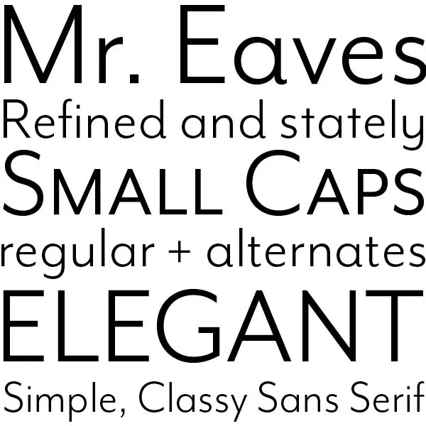
Mrs. Eaves was a popular serif typeface released in the late 1990s by Emigre. (I’ll always think of my friend Nikki Villagomez who adored Mrs. Eaves.)
But this is not Mrs. Eaves, it’s her “husband,” Mr. Eaves. Emigre's Mr. Eaves comes in a variety of looks: Modern, Sans, XL, XL Narrow. Mr. Eaves is a massive sans serif family with a wide variety of weights that compliments Mrs. Eaves.
I’m focusing on Mr. Eaves Modern Book, a classy sans serif with some interesting alternates and a full set of small caps. I adore the alternates on some of the lowercase characters that add a curved flourish to the stem. The x-height is low, but if you want larger lowercase letters, that’s what the XL version is for. Check out Mr. Eaves on Typekit.
(Not sure how to add fonts from Typekit to your computer? Check out this Adobe Help document on how to install Typekit desktop fonts.)

Bob Wertz writes about design, technology and pop culture at Sketchbook B. Bob is a Columbia, South Carolina-based designer, creative director, college instructor, husband and dad. He’s particularly obsessed with typography, the creative process and the tools we use to create. In his spare time, he explains the importance of real small caps. Follow Bob on Twitter and Instagram.
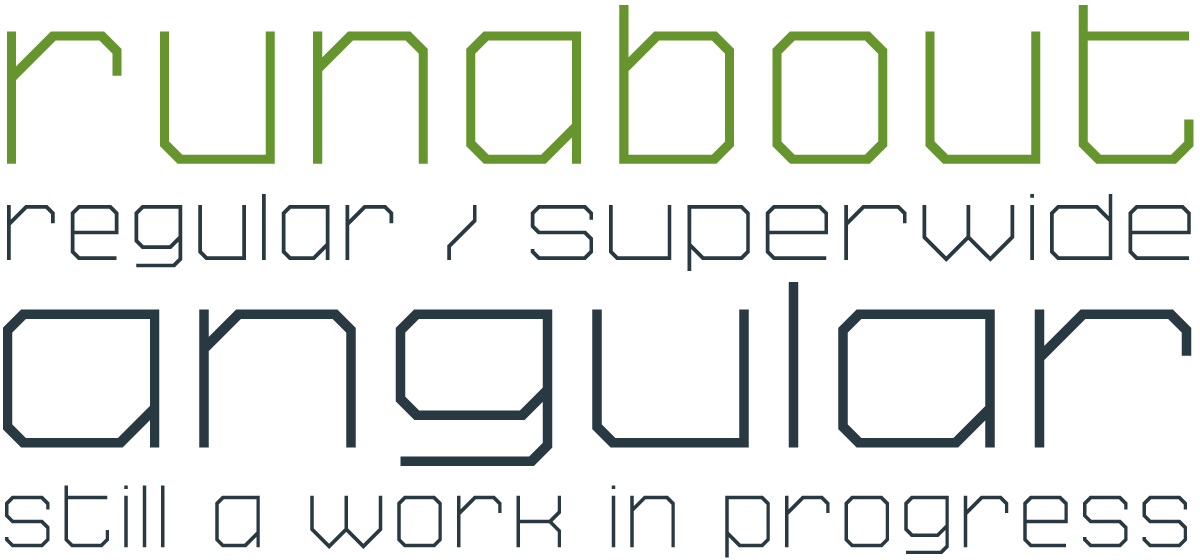
I started working on some sketches for a new typeface design and moved over to Fontstruct to prototype. I really like the way the prototype turned out, even if it looks virtually nothing like my sketches.
I’ve released two designs over on Fontstruct: SbB Runabout and SbB Runabout Superwide. They are free to download with a Fonstruct account.*

A couple of notes about Runabout:
* You can see and download all my published Fontstruct designs on the Sketchbook B Fontstruction page.
I’m putting the final touches on getting my new typeface family, Powerlane, live at MyFonts.com for purchase. In the meantime, I’ve posted a page with a sample of Powerlane and a typeface specimen PDF. Check it out and look back here for the official anouncement… hopefully this week.
Powerlane will feature 9 weights in both regular and oblique and an Outline version. A total of twenty fonts. Each font also has OpenType small caps and a handful of stylistic alternatives. Powerlane is inspired by 1920s constructivist posters.


SbB Sorts is a symbol font comprised of 66 simple icons. Over the years, I’ve needed many of these symbols for a quick layout or comp and had to take time to draw them. So I made this as a time saver for me, but figured someone else out there might also benefit from it. SbB Sorts includes:
A quick tip: If you are using a Creative Suite app, your best bet for finding a particular icon is to use the Glyphs Palette. Much faster than randomly typing characters.
You can download SbB Sorts for free in the Download Fonts section.