Fav8 > Best9
Forget ‘Best Nine.’ Why Fav8 is the way to go.
Read More
Forget ‘Best Nine.’ Why Fav8 is the way to go.
Read MoreFour shirt designs now on Cotton Bureau
Read MoreI love concepts cars and modular type, so Honda’s Urban EV is right up my alley.
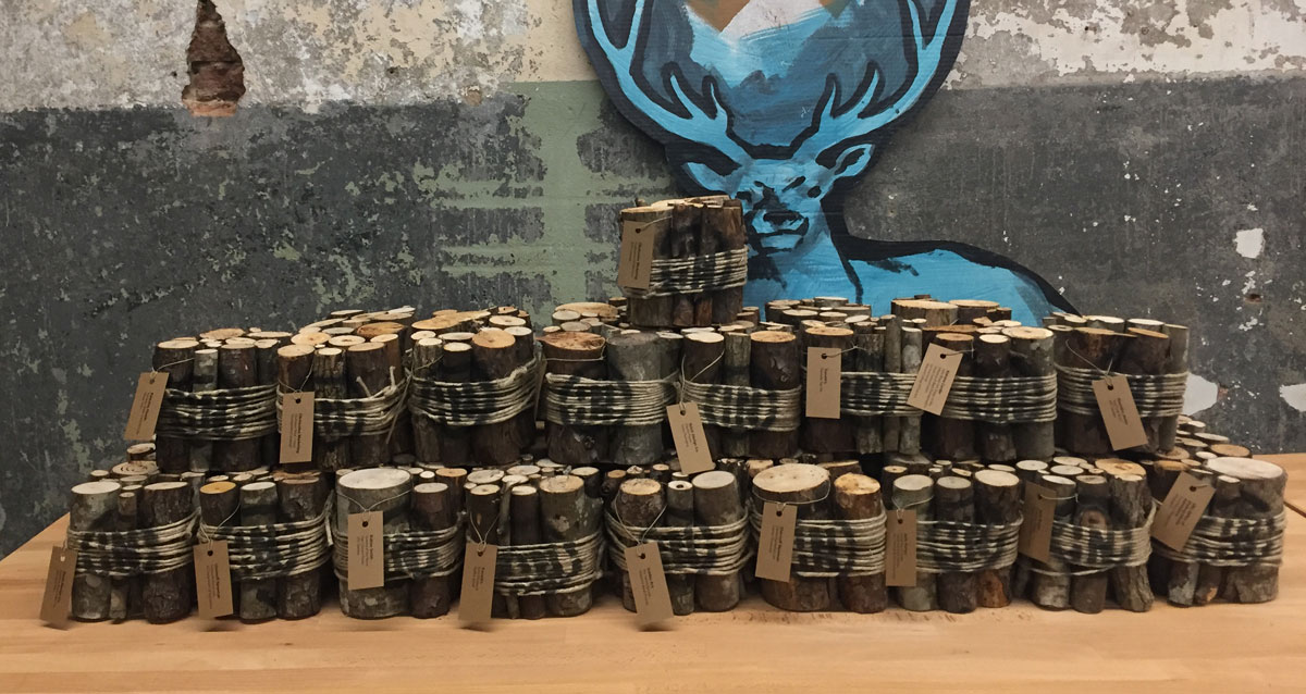
Read MoreInShow is AIGA South Carolina's annual awards program that honors the best work in the state of South Carolina. And each year, the award is in the shape of a cube.
It's the 21st InShow, but the 14th cube. The original cube design and current InShow logo were created by Vince McCall back when InShow was run by The Columbia Communicating Arts Society. AIGA South Carolina took over with InShow 10... We've kept the tradition going, and each year, the InShow cube is made from a different material or reflects a theme. So far, we've had:
Aluminum. Concrete. Cardboard. Fauxquarium. Ceramic. Toy Block. Junction Boxes. Fake Cheese. Present. Pillow. Lumber. Paper. Chalkboard.
And now Firewood.
A pile of cubes about to be awarded.
This year's cube is a bundle of kindling, tied together with twine. The logo is spray painted over the twine and the winners' names were printed on labels and tied to the sticks. The special judges awards used red twine. I won't bore you with the details, but building 42 "firewood" cubes was time consuming.
It's one of my favorite designs, although I really do love them all. I've had a hand in a bunch of cubes over the years, but I'm going to hand off responsibility for next year's cube. It really is a great project and it's time to let someone else have some fun. Plus, I think I've used up almost* all the ideas floating around my garage.
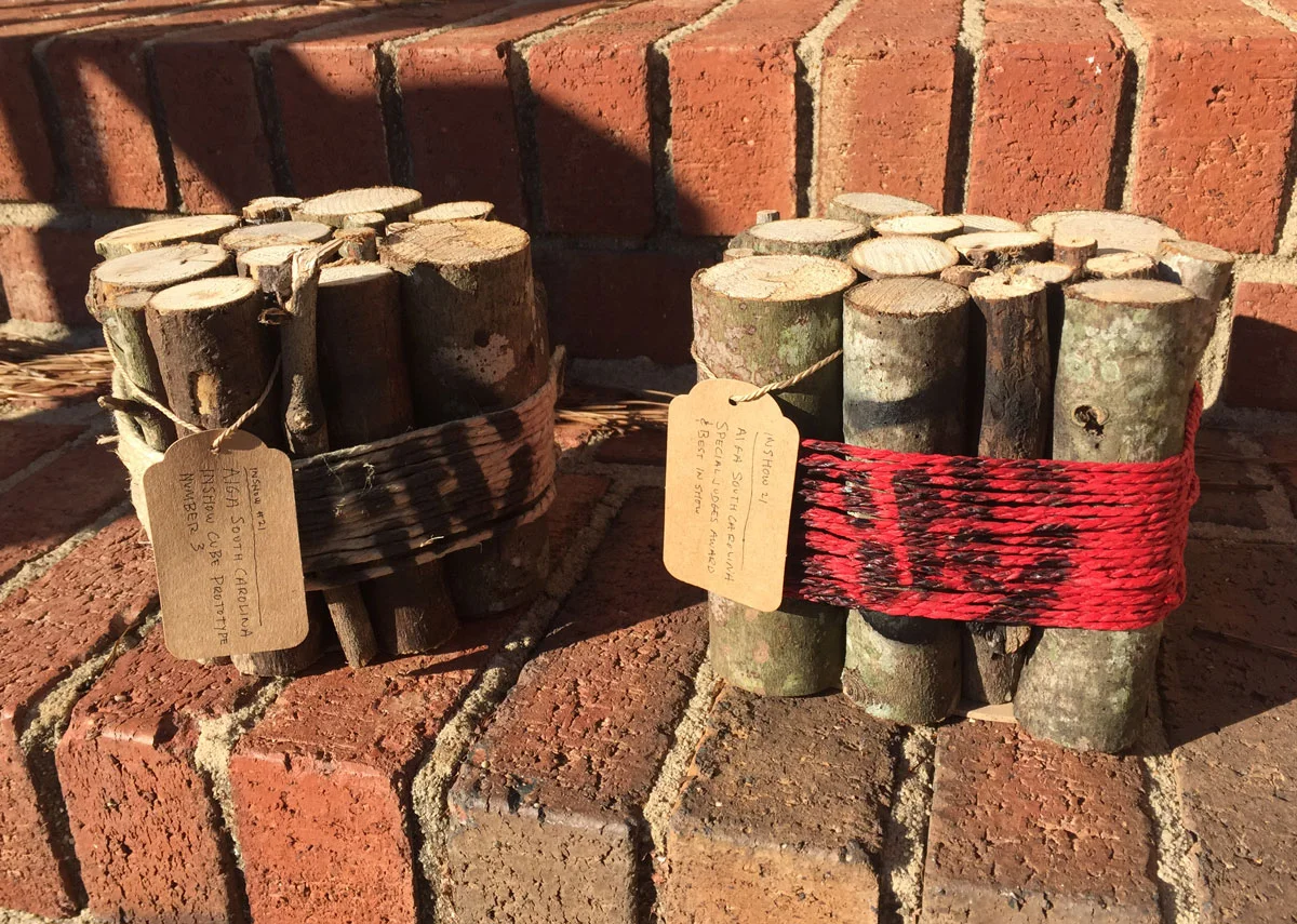
Almost final prototypes... I decided not to hand letter the tags on the final cubes.
* I can't tell you how many times I've tried — and failed — to make an affordable candle cube. It's the one that got away...
Bob Wertz writes about design, technology and pop culture at Sketchbook B. Bob is a Columbia, South Carolina-based designer, creative director, college instructor, husband and dad. He’s particularly obsessed with typography, the creative process and the tools we use to create. In his spare time, he thinks about new cube concepts. Follow Bob on Twitter and Instagram.
 Laser cut InShow logo
AIGA South Carolina’s InShow design awards were held last weekend. The award is always a cube — constructed from a different material every year.
I’ve been involved in the design and assembly of cubes in the past, designing the junction box cube in 2008 and helping with the pillow cubes last year. So I was really excited to design this year’s InShow cubes.
Maria Fabrizo was creating the supporting materials and was taking a rustic approach. Over the years, I’ve created a small collection of rejected cube prototypes. One prototype that I had experimented with previously was a wood block, made from a 6x6 timber cut into cubes. It seemed like a perfect fit for the theme.
I looked at a couple of different ways to add the logo and winner’s information to the blocks and settled on a plan to fabricate face plates and bolt them onto the solid blocks of wood.
 The face plate — laser cut and engraved.
I used Ponoko to laser cut and engrave the face plates, cutting the InShow logo into a sheet of bamboo plywood. And the cutting and engraving were done at one time so personalization was really easy.
Ponoko is a really interesting service — just upload an EPS file and they cut your design into a material of your choice. And they provided great service and support. (I’ve used Ponoko before. See my 2009 blog post about building a book shelf with their service.)
Once we got the face plates, we just had to screw them onto the cubes. Brynley Farr from ByFarr Design was able to get some awesome remnant wood from Southland Log Homes and had it cut into cubes. In all, we assembled almost 70 cubes.
 The face plates were screwed onto a solid block of wood. Check out the awesome wood grain on the side.
On the best of show and the special judges awards, the background of the InShow logos were painted — red for best of show and gold for the special judges award. (Check out this blog post from Fuzzco who won 10 cubes including best of show.)

I knew I wanted to create a specimen book for my new typeface, Powerlane. But I didn’t need that many copies. I decided to use MagCloud for production and was able to get a limited quantity for promotional use.
If you aren’t familiar with them, MagCloud is a company does on demand printing and publishing. They’ve recently increased their product line to include some larger format publications, posters, fliers and more. And you can use their platform to offer your publications or products for sale.
Build your PDF to their specs, upload it, proof it and you are done. Very easy. You can choose whether or not you want to make it available for public purchase. I ordered an handful of mine and was very happy with the quality.
(I will bring up the one really minor blemish — a tiny little bar code they stick on the back. It’s not a big issue and it is tiny, but if you are a perfectionist, it’s a little irritating. Most folks aren’t going to have an issue with it. But in case you were wondering, there is no way to get rid of it.)
I’ve made my Powerlane Specimen Book available for purchase at MagCloud. And you can choose to offer digital versions as PDFs or access it through the MagCloud iPad app. (The digital version of the Powerlane Specimen Book is completely free.) So go check it out.
And don’t forget that through October 23, Powerlane Complete is available for $59 ($140 off normal price) at MyFonts.com.
Finally, after at least 4 years of using the Sketchbook B name for my personal projects, I have letterhead and envelopes.
Once the cornerstone of a corporate identity, letterhead and envelopes are becoming an endangered species. Digital communication is replacing written correspondence. And many people just print from a word processor with a logo at the top. (I personally think this has to do with how impossible it is to figure out how to load letterhead into a laser printer.) Pre-printed letterhead has become a luxury.
I printed business cards earlier in the year, but I hadn’t even considered doing letterhead and envelopes. I just don’t send that much written Sketchbook B correspondence.
I started reading Letters of Note and Letterheady and was inspired to start working on concepts. Something that would work for small quantities. Maybe a stamp or a label. But I couldn’t quite settle on something I was happy with.
One day, I was helping clean out a cache of old materials at the office and ran across a bin of old media – CDs, SyQuest drives, Zip disks, 3.5 inch diskettes and even 5.25 inch diskettes.
The 5.25 inch disks brought back memories of my Commodore 64. Using Print Shop for the C64 was the first time I used a computer to create and print a “design.” And it was likely the first time I ever thought about typefaces.
I had found my inspiration:

I took the dimensions of a 5.25 inch floppy disk label and worked up a concept. I’m sure at some point in the not-so-distant past, a floppy disk label was part of the standard corporate identity package.
All of the type in the system was initially designed with Fontstruct and later refined with other software. SbB Periodic is used for the address information and SbB Dradis for the logo.
The labels are odd dimensions - you can’t exactly buy precut labels that size anymore - so I had a local vendor print them on crack-and-peel on their Indigo press. I ordered a small quantity of Pop-Tone Sour Apple paper and envelopes from French.

On the letterhead and envelopes, the label wraps around the paper so the address is on the back. And the label can be used on folders, CD cases, binders and more.

I was excited to help with the assembly of AIGA South Carolina’s InShow award for this year. Every year, the InShow “cube” is made of different materials or themes. Aluminum, concrete, cardboard, faux-quarium, ceramic, wood block, junction boxes, faux-cheese, a wrapped present and now…

The pillow cube was one we always wanted to do, but we never had the time to manufacture them all. So when Frances Grosse told me that they were going to finally do fabric cubes, I volunteered to help sew them. Frances picked out the fabric and patches and then she, Maria Fabrizio and I sewed cubes. The tags were created by Harrison Croft and pinned to the cube. (They aren’t in the picture above because these cubes are leftovers…) Definitely one of my favorite cubes.
Also: See my post from 2008 that details the process for making the junction box cubes.
I haven’t had much time to blog lately. September was about the craziest month I can remember, personally and professionally. But now that September is over (and okay, most of October, too), I’m ready to get back into posting regularly.
One of my recent projects has been the rebranding of Rolling Readers of the Midlands. Rolling Readers is a not-for-profit in Columbia, SC that sends volunteers into schools to read to children. And at the end of the year, the participating students get books of their own. It’s amazing to think that many low-income kids don’t have any books at home.
![]()
I’m working on a range of materials, but it all starts with a new logo. The main color is red, but my intent is to use the logo in a whole range of colors.
![]()
The “Rolling Readers” lettering was created with House Industries outstanding Photolettering.com service (specifically, Copeland Milo script).
We had a barbeque fundraiser a few weekends ago, B is for BBQ. The fundraiser had its own range of materials - logo, poster, t-shirts, and tickets. The lettering in the logo is also from Photolettering.com. (The poster is now in my projects section.)
![]()
I’ve released two new fonts at Fontstruct that I’ve been working on for a while. Transmission is a sci-fi inspired family available in two weights - Regular and Bold. Both fonts have an upper and lower case and a pretty wide range of foreign characters.
 A sample setting of Transmission Regular and Transmission Bold. Available at Fontstruct.
A lot of the ideas at work here are pulled from other Fontstructions – specifically Grande and Power Grid – and an unreleased font family that I’ve been working on for too long, Alliance.
All of the usual Fontstruct disclaimers apply: The type sizes and spacing are a little off and you have to sign up for an account to download. Head over to Fontstruct and download both Transmission Regular and Transmission Bold for free.
I was in Aiken, South Carolina over the 4th of July Weekend. I had my sketchbook and no computer. And while I was there, I quickly sketched out my newest Fontstruction: Aiken.
 Sample setting of Aiken, available at Fontstruct.
It’s admittedly an odd little typeface. And it’s a significant departure from what I normally do typographically. But I’m happy with how it’s come together. And when it’s used in a setting, it really does have a unique feel to it.
Standard Fontstruct disclaimers apply. You need an account to download the the spacing is a little bit odd. But if you want to play with it, head over to Fontstruct.
Yesterday, when I posted Sketchbook B: The Bookcase, I mentioned that the one problem that I had was not being able to select Ponoko’s US hub in San Francisco.
Well, it turns out that I just missed a setting. When you set up an account, you can select your preferred fabrication location. (I signed up before the US hub went live. I guessing if you open an account today, you’ll be given that option right up front.) So to get my job to go to San Francisco instead, all I had to do was go to My Account and under Preferences, select “the United States.”
 To select your fabrication location, just change the setting in your account.
So my only minor issue with Ponoko was, in fact, very easily correctable. A great service and definitely worth trying out…
A few months ago, I came across Ponoko, a New Zealand-based online fabrication service and marketplace. People make everything from jewelry to furniture. Ponoko offers a marketplace where people can sell products or plans.
I decided to make a small bookshelf for my office based on a bookshelf I made in Shop Class in the seventh grade. After signing up for a free account, I downloaded the “Making Guide” that explained the whole process.
 My bookshelf, assembled, with an assortment of books and DVDs.
Basically, you upload an Illustrator EPS with your cuts and pick your material. They laser cut the material and ship it to you. Using their template, I marked my cuts on an Illustrator file. You use different line colors to mark cuts and burns. Once I was done, I uploaded the file to their server and selected materials. Materials include various types of wood, acrylic, metal, felt, leather and cardboard.
I had one minor problem when ordering. I planned to have the piece made at their San Francisco shop to save on shipping. So I designed the shelf to use 6mm bamboo that was only available from the San Francisco shop, but when I went online, I could only use the New Zealand facility which didn’t have the material I wanted. (The San Fran shop is relatively new and I’m assuming, slammed.) So I had to change to another 6mm material - an Italian Poplar plywood - and pay a little extra for the shipping.
 A close-up of the laser burning, The edges are darker from the laser cutting. The “B” is burned in at medium strength.
It was a few days before they started processing the job. But when they started working on it, everything progressed quickly. And once the shipped it, it once took three days to get here from New Zealand. (And I didn’t pay for express shipping.) Total time from order to arrival was about two weeks.
I opened the box and started to assemble it. When assembling, I figured out that I made a couple of very minor measurement errors that made a couple of pieces a tight fit. A little sanding and filing and everything fit.
Based on the prototype, I’m going to make some changes to the design. The slots need to be slightly bigger. And with heavier books, there is some slight bowing, so I’m going to modify the support under the shelf. (Or look at a thicker material).
If you are interested in designing and creating 3-D objects, I highly recommend looking into Ponoko. The online experience and process is very well thought out. Everything is documented so it’s very accessible to designers who maybe aren’t familar with the fabrication process.
So, it’s really easy to switch to the San Francisco location… I was just looking in the wrong place. I just published a follow-up post to explain how to switch between fabrication locations.
I’ve made another Fontstruction available for download. (Actually, it went up last week and I hadn’t had a chance to promote it yet.) This one is called Power Grid and is inspired by early 20th century constructivist typeface designs. The character set is extremely complete, including a large number of foreign characters.
The usual Fontstruct disclaimers apply… you need to sign up for an account and the type sizes and line heights are off.
 Power Grid can be downloaded for free at Fontstruct.
Also of note is that Power Grid and my other Fonstructions, Big Thursday, Dingbots and Monsters and Grande have been selected as “Top Picks” by Fontstruct. You can download them all at the Sketchbook B page over at Fontstruct.