Tall Tale
Remembering that time I had coffee with a design legend at the now-closed Vista Starbucks.
Read More
InShow is AIGA South Carolina's annual awards program that honors the best work in the state of South Carolina. And each year, the award is in the shape of a cube.
It's the 21st InShow, but the 14th cube. The original cube design and current InShow logo were created by Vince McCall back when InShow was run by The Columbia Communicating Arts Society. AIGA South Carolina took over with InShow 10... We've kept the tradition going, and each year, the InShow cube is made from a different material or reflects a theme. So far, we've had:
Aluminum. Concrete. Cardboard. Fauxquarium. Ceramic. Toy Block. Junction Boxes. Fake Cheese. Present. Pillow. Lumber. Paper. Chalkboard.
And now Firewood.
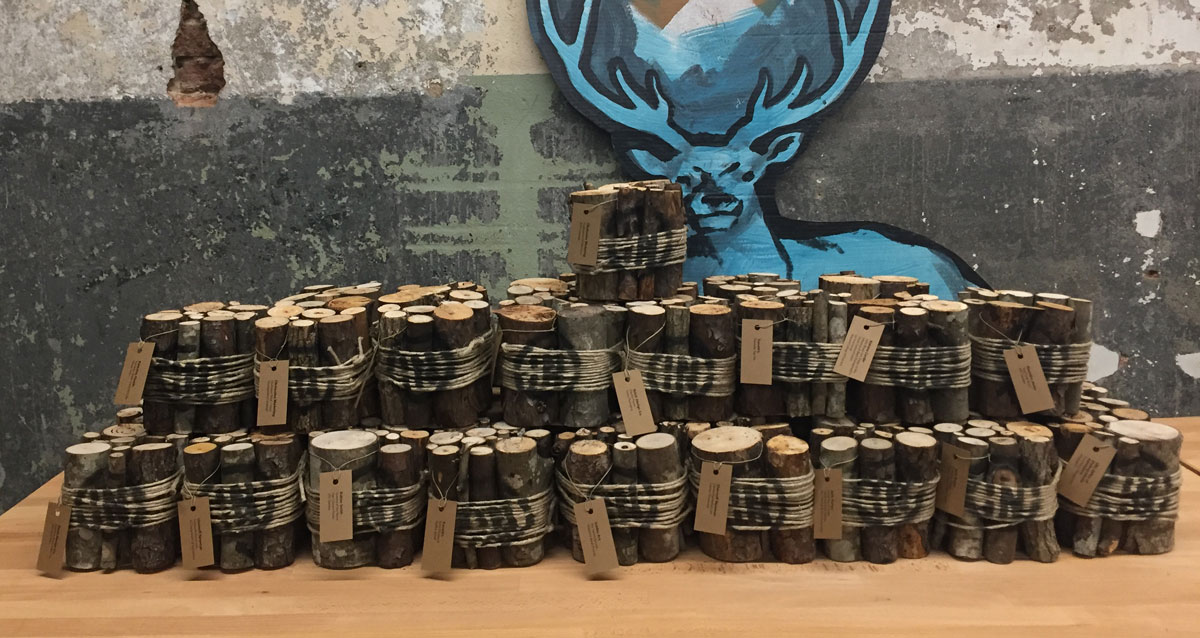
A pile of cubes about to be awarded.
This year's cube is a bundle of kindling, tied together with twine. The logo is spray painted over the twine and the winners' names were printed on labels and tied to the sticks. The special judges awards used red twine. I won't bore you with the details, but building 42 "firewood" cubes was time consuming.
It's one of my favorite designs, although I really do love them all. I've had a hand in a bunch of cubes over the years, but I'm going to hand off responsibility for next year's cube. It really is a great project and it's time to let someone else have some fun. Plus, I think I've used up almost* all the ideas floating around my garage.
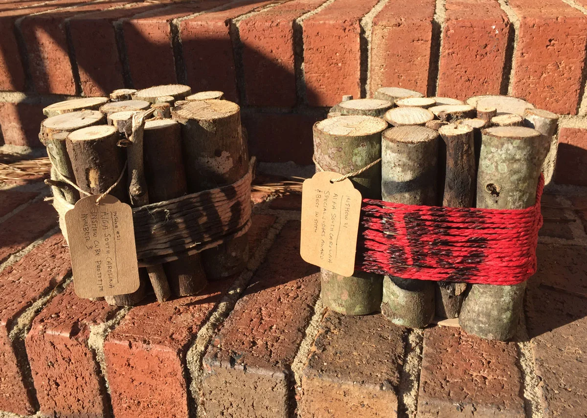
Almost final prototypes... I decided not to hand letter the tags on the final cubes.
* I can't tell you how many times I've tried — and failed — to make an affordable candle cube. It's the one that got away...
Bob Wertz writes about design, technology and pop culture at Sketchbook B. Bob is a Columbia, South Carolina-based designer, creative director, college instructor, husband and dad. He’s particularly obsessed with typography, the creative process and the tools we use to create. In his spare time, he thinks about new cube concepts. Follow Bob on Twitter and Instagram.
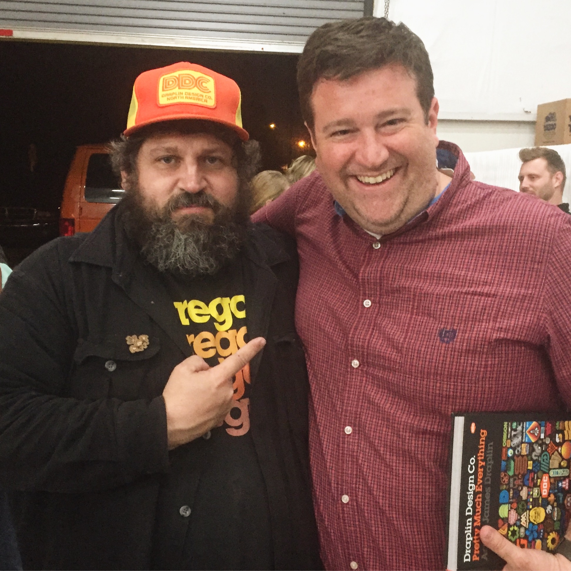
I saw Aaron Draplin for the fourth time on Thursday night when he came to the Half and Half in Columbia. Over the last years 15 years or so, between CCAS, AIGA South Carolina and Converge SE, we’ve had a bunch of awesome designers come through Columbia… DJ Stout, David Carson, Chip Kidd, James Victore, Seymour Chwast, Michael Beirut, Sean Adams, Sagmeister… and that’s a really incomplete, partial list.
But Draplin is one of my favorites.
What I love about Draplin is how much he loves to make things. Other designers are passionate about solving business problems. Or challenging convention. Or tackling large international clients. But Draplin loves to create things. Sure, he solves problems for clients, he challenges conventional thinking, he has some large international clients. But the thing that really seems to drive Draplin is putting things out into the world, which I really do feel makes him unique among the big names in design.
(It's also the reason why Draplin's work is known beyond the design world. Field Notes is loved by people all over the world and they love Draplin, too.)
If he comes to a town near you, see him. You won't be disappointed.
Bob Wertz writes about design, technology and pop culture at Sketchbook B. Bob is a Columbia, South Carolina-based designer, creative director, college instructor, husband and dad. He’s particularly obsessed with typography, the creative process and the tools we use to create. In his spare time, he attends lectures. (Because he is so much fun.) Follow Bob on Twitter and Instagram.
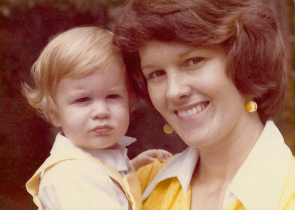
Mom and me in August 1976. Yes, that's me with the crazy curls.
I was about to graduate from college and was at home telling my Mom about my decision to be a designer. For most of my college career, my major had been journalism or public relations. But near the end of my college career, I fell in love with design and changed my major. Mom was normally the most supportive person in the world, but that day, she was skeptical. "Bob, you don't exactly handle criticism well."
I thought about Mom when I read Michael Bierut's essay Graphic Design Criticism as a Spectator Sport on Design Observer earlier this week. (If you have not read the essay, do yourself a favor and read it now.)
Michael Bierut came to speak at an AIGA South Carolina event several years back. I remember him talking honestly about the challenges of pitching work to clients. It was the first time I could remember a "rock star" designer expressing that sometimes, you are limited by a client.
It resonated with me. As designers, I think we often fall into the trap of thinking that our solution is perfect and flawless and that the client should just trust us. But it doesn't always happen that way, even for famous designers.
Michael talks in his essay about how Pentagram spent over two years on redesigning UPS. And they never could convince them that their solution was the right one. Several years later, Futurebrand won the redesign, but their solution was widely criticized.
His point in telling the story is that he understood Futurebrand's challenges with the UPS redesign. But I took something else from it: No matter how large and well-respected you and your firm are, you still have to convince a client that your solution is right for them. Sometimes, you will fail.
I have students and friends that absolutely explode with frustration when their work is criticized. Or when clients ask for significant changes. But this is part of the job and part of the environment that we live in today. This is part of the career we have chosen. We have to deal with the criticism as constructively as possible and move on.
Futurebrand released a redesign of American Airlines last week, replacing the iconic Massimo Vignelli mark. Personally, I love the redesign. (And I love the original.) Commentary from designers seems to be split and there are many who are harshly criticizing it. Even Massimo Vignelli. It doesn't matter who you are, you can't please everyone.
My mom was very astute to realize that if I was going to be successful as a designer, I needed to understand that criticism is part of the job. I've worked really hard to deal with criticism in a positive way and to encourage others to do the same.
My oldest daughter is very creative and interested in design or art as a career when she grows up. I've thought about what advice I'll give her about criticism if that's the route she takes. I've settled on this:
 Laser cut InShow logo
AIGA South Carolina’s InShow design awards were held last weekend. The award is always a cube — constructed from a different material every year.
I’ve been involved in the design and assembly of cubes in the past, designing the junction box cube in 2008 and helping with the pillow cubes last year. So I was really excited to design this year’s InShow cubes.
Maria Fabrizo was creating the supporting materials and was taking a rustic approach. Over the years, I’ve created a small collection of rejected cube prototypes. One prototype that I had experimented with previously was a wood block, made from a 6x6 timber cut into cubes. It seemed like a perfect fit for the theme.
I looked at a couple of different ways to add the logo and winner’s information to the blocks and settled on a plan to fabricate face plates and bolt them onto the solid blocks of wood.
 The face plate — laser cut and engraved.
I used Ponoko to laser cut and engrave the face plates, cutting the InShow logo into a sheet of bamboo plywood. And the cutting and engraving were done at one time so personalization was really easy.
Ponoko is a really interesting service — just upload an EPS file and they cut your design into a material of your choice. And they provided great service and support. (I’ve used Ponoko before. See my 2009 blog post about building a book shelf with their service.)
Once we got the face plates, we just had to screw them onto the cubes. Brynley Farr from ByFarr Design was able to get some awesome remnant wood from Southland Log Homes and had it cut into cubes. In all, we assembled almost 70 cubes.
 The face plates were screwed onto a solid block of wood. Check out the awesome wood grain on the side.
On the best of show and the special judges awards, the background of the InShow logos were painted — red for best of show and gold for the special judges award. (Check out this blog post from Fuzzco who won 10 cubes including best of show.)
I was excited to help with the assembly of AIGA South Carolina’s InShow award for this year. Every year, the InShow “cube” is made of different materials or themes. Aluminum, concrete, cardboard, faux-quarium, ceramic, wood block, junction boxes, faux-cheese, a wrapped present and now…

The pillow cube was one we always wanted to do, but we never had the time to manufacture them all. So when Frances Grosse told me that they were going to finally do fabric cubes, I volunteered to help sew them. Frances picked out the fabric and patches and then she, Maria Fabrizio and I sewed cubes. The tags were created by Harrison Croft and pinned to the cube. (They aren’t in the picture above because these cubes are leftovers…) Definitely one of my favorite cubes.
Also: See my post from 2008 that details the process for making the junction box cubes.
TypeTrust is offering a family of fonts designed by Chris Bilheimer and Micheal Stipe for REM albums and tour materials. The REM Collection consists of three typefaces: Accelerate, Orange and Tourfont. They are available for $15 each or $30 for the entire Collection. I love the fact that they’ve released these formerly project specific fonts.
Chris Bilheimer spoke at AIGA South Carolina in March of 2007. He’s a great guy and amazingingly talented. Although the bulk of his work is for REM, he also works with bands like Green Day and Weezer.
Read all about them and see examples over at TypeTrust.
(And thanks to Marius at Zoo Valdes for bringing this to my attention…)
I had the privilege of moderating the AIGA South Carolina Web Panel discussion a few weeks ago. The panel featured a number of local web designers and developers - Gene Crawford and Jay Berry from Period Three; Matthew Smith from Squared Eye; Jason Beaird, Greg Lunn and Ken Seals from Cyberwoven; and AIGA SC Vice President and hired gun James Miller.
We had a really fascinating discussion about trends in web design and how web designers work. A few quick reflections:
Continuing education. The web is constantly changing. And for web designers, that means that they need to keep up with the most current techniques and methods. Most use internet resources to keep up with new concepts and the web design industry has essentially created a virtual cooperative to share information online.
Personally, I think this commitment to continued learning and sharing is one of the most fascinating parts of the web development community. I feel like the online print design resources are focused mainly on inspiration. The web community has managed to merge the inspiration element with technical knowledge and information on best practices. There really seems to be a dedication to improving the quality of the industry as a whole.
Side projects. Pretty much everyone on the panel has a side project. Matthew has Pattern Tap. Gene and Jay have Unmatched Style. Jason has Publix for Pennies. As I look around at other established web professionals, they all seem to have developed side projects as well. The goals for these side projects are very rarely profit. These projects are essentially client-less projects that allow for exploration and experimentation. A chance to use the skills that you have learned to contribute back to the community in some way.
(Honestly, we really don’t have an equivalent to these side projects in the print design world. The printing process is so expensive, you really need to have some sort of client to foot the production bill… Our closest parallel is probably working pro bono.)
IE6 sucks. Really, if you are still using Internet Explorer 6, upgrade now. Firefox and Safari are fine options. And free…
Client relationships. In the print world, client relationships are often simple transactional affairs. There is a project beginning and a project end - usually resulting in a deliverable of some sort. In the web world, you have to find a way to deal with the ongoing maintenance of the site and other issues like hosting and email. With web work especially, a good contract is vitally important.
The panelists were going to pool a number of resources and publish them online. I’ll link to them as soon as the list goes live.
When I was looking through pictures for my post on the InShow cube, I ran across a shot I had taken before judging with my iPhone. This is only a portion of the entries. So many incredible entries…
 Set up for InShow judging at George Fulton Studios
InShow is AIGA South Carolina’s annual design competition. While most design competitions have plaques, statuettes, acrylic blocks and other mass-produced awards, InShow has the “cube.”
Every year, the cube is manufactured from a different material. It’s been aluminum, concrete, cardboard, acrylic, ceramic and wood and is always roughly 5 inches.
 The final prototype for the 2008 InShow Cube.
The cube for the 14th Annual InShow was manufactured out of electrical boxes and carriage bolts.
I actually built the prototype for this year’s show as a backup for last year. The wood cubes had been shipped, but there was a slight possibility they would not arrive in time for the Gala. So I went to Home Depot and assembled a quick prototype from off the shelf parts. Something we could assemble quickly if the wood awards did not arrive.
However, the wood cubes did arrive in time, so the electrical box prototype was saved for the 2008 show.
 Original prototype with duct tape hiding gap in the center and black labeling.
I was at least partially involved with the last five cubes: cardboard, acrylic, ceramic, wood and now electrical box cubes. And I’ve learned a lot from the process. There are several specific challenges to building a custom award.
Find a material. For the InShow cube, we use a new material every year. And every year, we go through a bunch of concepts and ideas. The cube needs to have a certain aesthetic value - after all it is an award - so the material needs to look nice when completed. And budget is an issue, too. An expensive material or process can completely throw the budget off.
The parts for the electrical box cubes came off the shelf from local hardware stores. We debated a few finishing options - like using duct tape to hide the gap between the boxes or some different combinations of parts. But in the end, we went with the cleanest execution of the concept.
 The last five InShow cube prototypes.
Now make 60. It’s one thing to make a prototype. It’s another thing entirely to make 60 awards. Whatever concept you settle on has to scale. Building 60 cubes can be a massive undertaking, especially if you don’t think it through completely. Part of the design process is figuring out the most efficient way to build a larger quantity.
However, 60 is also too small of a number to be efficiently produced using a large-scale manufacturing process. So much of the work is done by hand.
The only scale related issue with the electrical box cube was finding enough electrical boxes. This is not a commonly used box size and is not stocked in large quantities. And with 2 boxes per cube, we were looking for 120 boxes. I had to buy all the stock at three different hardware stores to find enough boxes.
Whose award is it? The hardest and most time consuming part of building a custom award is personalization. The award has the name of the winning firm and title of entry. We also have a handful of judge’s awards that need to look a little different than the regular award.
I used a Dymo 3-D label maker to put the names on the awards. On the prototype, I used black labels and spray painted a black InShow logo. I wanted the label to look more intentional and so I experimented with different combinations. I finally settled on silver labels - which meant I had to spray paint the completed labels. I was a little more time consuming, but I felt the more subtle effect from silver labels on the silver box was worth the extra effort.
I changed the color of the InShow logo from black to dark gray (although most people still thinks it looks black). The special judges awards sported magenta logos - an accent color we picked up from the Call for Entries mailer.
 Four prototype faceplates for the awards.
I have no idea.* Lots of concepts have been thrown around, and every year, it becomes that much harder to find another concept. But inevitably, someone will come up with a material and an execution that will work.
* Okay, I have a few ideas. And even a few more prototypes…
So here are the posters I created for AIGA South Carolina’s Porfolio review. Illustrations by Marius Valdes.
We wanted a before/after look that included both the illustration and the type.

Before
After