Washington Redacted

There's been a lot of talk this summer about renaming the NFL's Washington Redskins. But this week, sports talk radio has discussed that some announcers will be going out of their way to not even say the name "Redskins" during a broadcast. 

If the network truly deems the word to be offensive, they could just bleep out the word "Redskins" with the 7-second delay. Just think...

"Welcome to an epic battle between division rivals. The Dallas Cowboys versus the Washington BLEEEEEP. John, what do you thing about the matchup today? What do the BLEEEEEP need to do to beat the Cowboys."

Awesome, right. Or considering how much the Federal Government loves to redact classified documents, we could just rename them the Washington Redacted. The logo could look like this:

The logo for the Washington Redacted.

The logo for the Washington Redacted.

Same colors. And same number of letters as "Redskins" so die hard fans can pretend the name of their team hasn't changed. Think of the possibilities. You could redact the name of players on their jerseys. Announcers can use all sorts of bad puns. Fans could chant "Redact that kick." Or not.

Washington Redacted, secondary mark.

Washington Redacted, secondary mark.

Of course I'm kidding, but it will be interesting to see what happens with the Redskins name. I'm pretty sure Daniel Synder isn't willing to change it, but who knows, maybe the league or some other outside pressure will force him to change it.

(And by the way, the "official" typeface for the Washington Redacted is Power Grid 2.0, which I released this week. You can buy the entire family for $29.)

Typekit integration

At the top of the Type menu in Adobe InDesign CC is a new addition: Add Fonts from Typekit...

Selecting it will open Typekit in a browser window and you can choose typefaces that you would like to install.

Pick which versions and weights you want to use and sync them to your computer. There are lots of tools to help you discover new type, allowing you to search for type styles, thicknesses and weights. Creative Cloud automatically downloads and installs the fonts for you. 

A large selection of type, including Mark Simonson's excellent Proxima Nova, are available as part of your Creative Cloud subscription. I'm surprised at how many folks have no idea that this is part of your monthly subscription cost. And the type can be used in any app.

Every Wednesday, I post a tip on an Adobe product.

Sketchbook B now on Creative Market

So far, I've only offered my fonts for sale at MyFonts. Today, I've added another distribution channel. You can now buy Valdes Clarendon at my shop on Creative Market.

Creative Market is a new marketplace that sells fonts, images, templates, themes and more. I'm excited to be a part of it. I also like the idea that I can sell more than just type. (As for what those products will be... well... I've got some ideas...)

For now, Powerlane will remain a MyFonts exclusive. I'm not sure it's right for Creative Market. But my plan going forward is to offer all my fonts through Creative Market and MyFonts.

Museum-caliber modular type

Last week, Stefan Sagmeister unleashed the most high-profile modular typeface design since Wim Crouwel's New Alphabet.

The redesign for the Jewish Museum in New York features two modular typefaces. You can get all the details over at Brand New. It's a complicated and massive identity. I like what Sagmeister has done and the whole system works well. But those modular type designs stood out to me — especially the primary "script" type.

As a fan of modular type and the work of Crouwel in the 60's and 70's, it's really nice to see a high-profile, modern designer embrace a modular aesthetic.

(If you want to play around with modular type, head over to Fontstruct and build something awesome.)

Thanks!

Powerlane is now released and while I’m still working on marketing and promotion, I really want to take a second and thank a lot of people that inspired me and helped me along with Powerlane.

My Wife

When I sat down to do the interview with The State, one of the first questions Cassie asked was something along the lines of “You have a full time job, you teach, you have three kids and you design type in your spare time. How does your wife feel about all of this?” I chuckled and simply responded that my wife is awesome.

My wife, Liz, is an artist, too. And a teacher. She understands why I want to design my own type. And why I couldn’t say no to the opportunity to work with a great group of students this semester.

Is it crazy? Sometimes, yes. We have to work really hard to coordinate schedules and find time for everything. But we do. Sometimes, I’m up really, really late. But without the support from Liz, I couldn’t accomplish any of this.

Marius Valdes

Marius and I get try to get together for lunch semi-regularly to brainstorm and bounce ideas off of each other. It’s always inspirational to sit down for a little while and throw ideas around.

I love working on projects with Marius. A while back, I created a custom variation of one of my typefaces for his Secret Species project. Power Grid, was upper case only and he needed a lower case. So I cranked out a version for him to use. I intended to polish it later, but never got around to it.

Fast forward to this year, when Marius and his awesome Secret Species project was featured in HOW magazine. As a type designer, it’s energizing to see your typefaces in use. After seeing Power Grid on the pages of HOW, I started working on it again. The result is Powerlane.

AIGA South Carolina

I owe a lot to AIGA South Carolina. It’s the chapter I helped start 7 years ago and it’s been a major influence on my career. Over the last few years, I’ve had the joy of seeing and interacting with creatives like Alex Isley, Michael Bierut, Jill Bell, Seymour Chwast, Chip Kidd, James Victore, Chris Bilheimer, Sean Adams, Stefan Sagmeister and more.

But in Spring of this year, AIGA SC brought in designer/illustrator Jude Landry and then a couple weeks later, designer/all-around-awesome-guy Aaron Draplin. And the combination was exactly the inspiration I needed. They are both amazing creatives with an entrepreneurial streak. And listening to them got me completely motivated to tackle the typeface and make it available commercially. And then a few months later, Rich Roat from House Industries came in to speak about all of their typographic successes.

It was the perfect line up of speakers for me at the perfect time.

Fontstruct and the Fonstruct Community

Sometime in 2009, I was home — sick in bed. Having given up on awful daytime TV, I was surfing the internet and stumbled upon Fontstruct and started experimenting. Powerlane started life as Power Grid, a Fontstruction. It was one of my early modular constructions, but I was very happy with it. But the modular structure made it difficult to expand Power Grid into the family I had in my head and I eventually chose to start from scratch.

But Fontstruct’s influence goes far beyond prototyping. The community at Fontstruct was encouraging and inspirational. They gave solid feedback on character designs. They kept me motivated when I was discouraged and challenged me to improve my designs.

I’ve gotten so busy lately, I haven’t been able to get back over to Fontstruct. But maybe I should enter the new stencil contest…

Glyphs

Finally, thanks to Georg Seifert for developing an awesome type design tool in Glyphs. It’s powerful and easy to use.

Recently, they’ve started blogging about how to get the most out of Glyphs. And many of their tips and tricks were very helpful in building Powerlane.

Don’t forget that through October 23, Powerlane Complete is available for $59 ($140 off normal price) at MyFonts.com.
SbB Raceday and Raceday Oblique

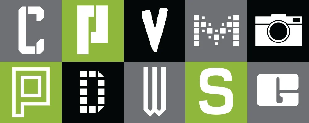
I’ve finally gotten around to finishing SbB Raceday. It’s a bold display typeface, inspired by some of my modular projects. Available with regular and oblique versions. You can download it for free from the Download Fonts section.

This is my first typeface constructed using Glyphs. (I don’t count SbB Sorts since it’s a symbol font.) I really enjoyed using Glyphs. It’s much easier to use than other software I’ve used and very powerful.

SbB Sorts

SbB Sorts is a symbol font comprised of 66 simple icons. Over the years, I’ve needed many of these symbols for a quick layout or comp and had to take time to draw them. So I made this as a time saver for me, but figured someone else out there might also benefit from it. SbB Sorts includes:

  • Social symbols: Simple icons for Facebook, Twitter, Linked In and more. Plus a Like-style thumbs up.
  • Random shapes: Locks, triangles, stars, a heart, dice and other potentially useful items.

A quick tip: If you are using a Creative Suite app, your best bet for finding a particular icon is to use the Glyphs Palette. Much faster than randomly typing characters.

You can download SbB Sorts for free in the Download Fonts section.

Amazing FontBook App for iPad

The new FontBook app for the iPad is simply incredible. Created by Fontshop International, it’s an amazingly comprehensive resource. Look up typeface designs by origin date, class, designer name and more. Select your favorite fonts. Post samples to Twitter or Facebook. Compare designs. Explore similar designs.

If you are a serious typography fan and you have an iPad, go buy it now. It’s well worth the $5.99 purchase price. And if you are a serious typography fan and don’t have an iPad, it’s time to purchase one.

Now, I hope a few of my other favorite foundries release amazing iPad apps featuring their type libraries. I’d purchase a Hoefler-Frere Jones, House Industries or Adobe type specimen book in an instant.

Explore type by class, designer name, typeface name, foundry or year of release.Explore sample settings of typefaces.

Compare font designs and even swipe through preset background and type colors.

Periodic

I designed the original Periodic as a pixel font on Fontstruct. As I played with the design, the more I fell in love with it. I like the idea of using the exposed pixel as a design element. Over the past few months, I’ve been tweaking it so that it would work better in print. And I’m using Periodic on my new business cards.

For the final version, I’ve connected the corners and broken the strict pixel grid for some of the special characters. The entire design is monospaced with old style numerals. I’ve also added an oblique version. It’s very readable at small sizes and distinct at display sizes. Get SbB Periodic from the “Download Fonts” section.

Pixels in Print

I’ve been wanting to get Sketchbook B business cards for a while. And I wanted to use my own fonts for the identity system. I’ve played around with several different looks, but never pulled the trigger and ordered them. Finally, my new cards are printed and they use two typefaces that started life on Fontstruct: SbB Dradis Alpha and Periodic.

I just released the SbB Dradis family. It’s an odd experimental display typeface that can be used without spaces in between the letters. I’ve updated the masthead on the site with a new Sketchbook B logo in Dradis.

Periodic is a monospaced, pixel font with old style numerals that I designed to be used in print. For most designs, visible pixels are a no-no, but I think they add some texture and interest. I’m using a version of Periodic that I’m still tweaking. It’s a refined version of the one I quietly released on FontStruct. Once I finish polishing Periodic, I’ll release it here.

Dradis Alpha and Beta

I’m releasing an OpenType version of Dradis, an experimental typeface family based on one of my FontStruct creations.

Dradis is built from a series of simple shapes to create letters. The original concept was to have a display typeface which could be read without any spaces between the letters. SbB Dradis Alpha and SbB Dradis Alpha Oblique have no spaces between the letters and yet, is surprisingly readable.

But as I played with the design, I discovered that adding a little extra space maintained the distinctive character of the design, but made it more readable at smaller display sizes. So I created a second set - SbB Dradis Beta and SbB Dradis Beta Oblique - that keep the same character design, but adds spacing between the letters.

As an experimental typeface that is based on a strict grid, it doesn’t include every single special or foreign language character, but it includes enough for most English language display usage. If it’s missing a character that you need, let me know and I’ll see if I can add it.

You can download the SbB Dradis family over in the Download Fonts section.

(As an aside… The name Dradis is from the Ron Moore version of Battlestar Galactica. Dradis is the Colonial version of radar. On the show, all of the paper, pictures and other printed materials had the corners cut at 45 degree angles. When I was designing this, most of the corners of the letters had 45 degree angles. So I figured a Galactica related name was appropriate.)