Another one goes subscription
My favorite writing app, Ulysses, switches to a subscription model.
Read More
My favorite writing app, Ulysses, switches to a subscription model.
Read More
Ulysses is my favorite app. I use it every day for everything I write and it’s the only non-Adobe app I consider essential.
But there is one, tiny little feature I’d like to request: We need a Share Menu extension for the Mac.
When I’m in Safari on my iPhone or iPad, I use the share sheet to send links to Ulysses. If I’m working on a story for one of my blogs and find a link I want to use in a post, I send it to Ulysses and it appears in a new sheet. It makes research just a little bit easier and when I’m ready to write the article, the link is right there. And on iOS, it works perfectly.
But on the Mac, if I’m browsing in Safari and I want to send a link to Ulysses, there is no Share Menu extension for Ulysses. I end up manually copy and pasting the link. Or if I don’t have Ulysses open, I might add it to Read Later and then move it over later. Other apps like Day One and Evernote have Share Menu extensions and I’d like to see one for Ulysses.
I really love Ulysses. The absence of a Share Menu extension is only a minor inconvenience and really isn't that big of a deal. I may be the only person that would use it, but it sure would make my workflow a little more fluid. Hopefully, it's something they will consider.
Bob Wertz writes about design, technology and pop culture at Sketchbook B. Bob is a Columbia, South Carolina-based designer, creative director, college instructor, husband and dad. He’s particularly obsessed with typography, the creative process and the tools we use to create. In his spare time, he looks for new ways to incorporate Ulysses into his workflow. Follow Bob on Twitter and Instagram.
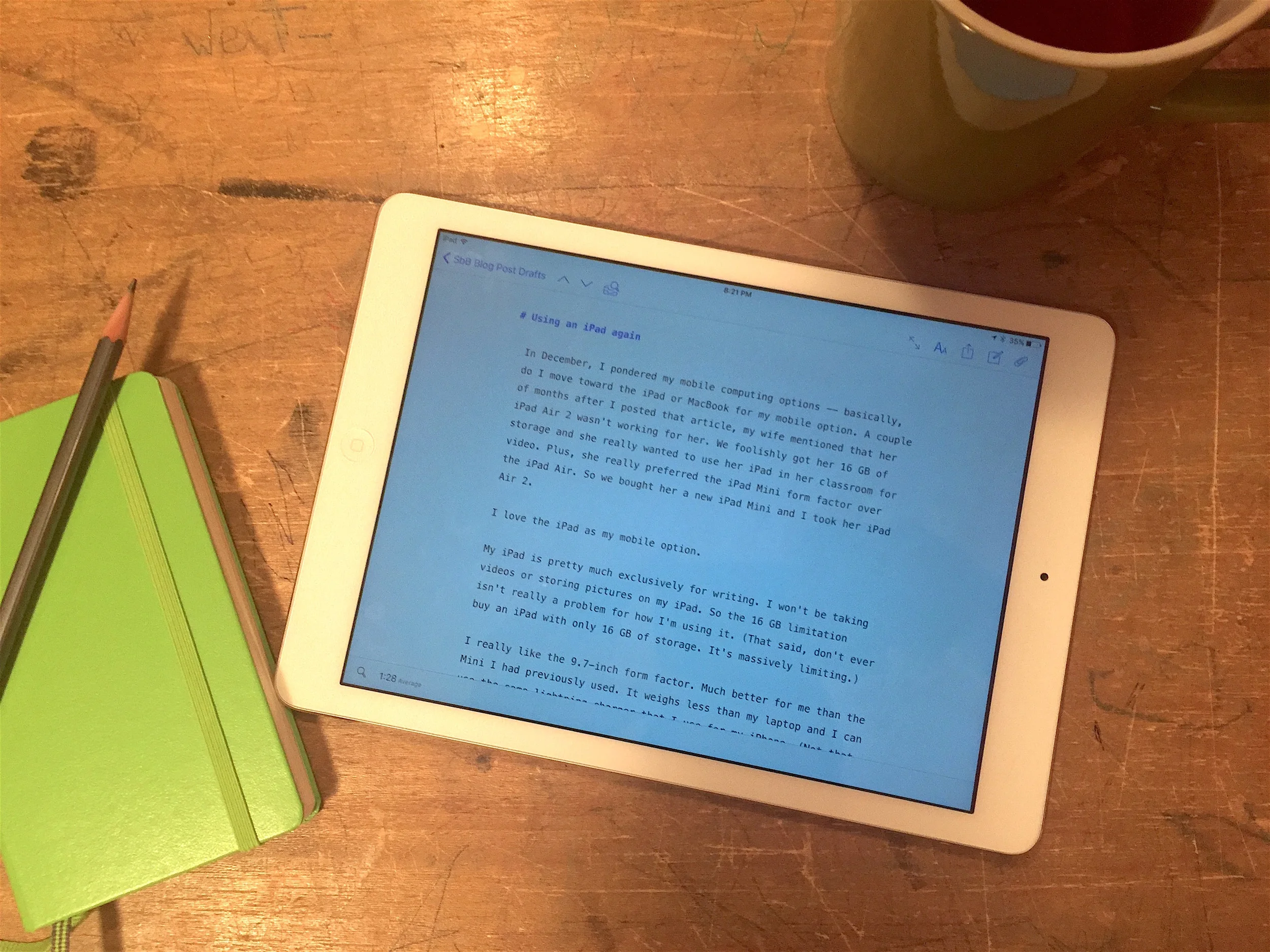
In December, I pondered my mobile computing options. Do I move toward the iPad or MacBook for my mobile option? A couple of months after I posted that article, my wife mentioned that her iPad Air 2 wasn't working for her. We foolishly got her 16 GB of storage and she really wanted to use her iPad in her classroom for video. Plus, she really preferred the iPad Mini form factor over the iPad Air. So we bought her a new iPad Mini and I took her iPad Air 2.
I love the iPad as my mobile option.
My iPad is pretty much exclusively for writing. I won't be taking videos or storing pictures on my iPad so the 16 GB limitation isn't really a problem for how I'm using it. (That said, don't ever buy an iPad with only 16 GB of storage. It's massively limiting.)
I really like the 9.7-inch form factor. Much better for me than the Mini I had previously used. It weighs less than my laptop and I can use the same lightning charger that I use for my iPhone. (Not that I really ever need the charger on the road... The battery lasts for an insanely long time.)
But the real reason I love my iPad? Ulysses. My favorite writing app for the Mac is also on iPad and it's perfect. The syncing between my Macs, my iPhone and my iPad means that I can write or edit anywhere, on any device. It's amazing how a single great app can completely change the way I use my iPad.
I don't see going back to a Mac for my mobile device.* While this iPad will work for the foreseeable future, the new 9.7 inch iPad Pro looks like a perfect machine for me. I'm intrigued by the Apple Pencil and the keyboard cover. I don't mind typing on the screen, but I'm much faster and more accurate on a physical keyboard.
Hopefully, Apple will continue to improve the hardware and developers will create pro caliber apps that take advantage of iOS ecosystem.
* Although, let's be realistic. I'm probably going to want one of the rumored MacBook Pros when they are finally released.
My go-to writing app on my Mac and my iPad is Ulysses. I love the simple structure and that I can pretty much write anything... from a blog post to something much longer. And my writing syncs between my devices.
Now, my writing syncs between all my devices. Ulysses for iPhone launched today. The app is impressive and includes some great implementations of iOS features — iCloud synced all my content effortlessly, Handoff works great between devices and the share extension works perfectly.
I don't plan on writing long essays on my phone, but I think I'll use Ulysses on the iPhone frequently:
Brainstorming. When an idea strikes, I can add a note directly to the writing app. Since I always have my iPhone with me, I'll be able to capture those random thoughts and convert them into actual posts or essays more easily.
Links. I can use the share extension to send links I find directly to Ulysses. For links I want to write a post about, this will be much more convenient than using a service like Evernote.
Edit on the road. The keyboard on my iPhone isn't great for writing longer pieces, but Ulysses should be perfect for reading and editing on the go.
Ulysses isn't for everyone. It's a Markdown editor, so you need to be comfortable writing in Markdown. And it's not cheap. Ulysses for Mac is $45 and the mobile version is $25. In this era of free and freemium apps, this is an expensive app, but Ulysses is a professional tool and worth every penny.
I was expecting to have to pay for the iPhone version, but because I had already purchased Ulysses for iPad, I got the new Ulysses Mobile with support for iPad and iPhone as a free upgrade.
If you are looking for a Mac writing ecosystem and like working in Writedown, Ulysses might be the perfect system for you. There’s a great review over at MacStories if you want lots of specific details.
Adobe Bridge wasn't upgraded with the Creative Cloud 2015 update. The last time it was updated, the main change was removing the Output module – which for many of us was the only reason to use Bridge. So obviously, either:
It's important to remember that Bridge was created to be a replacement for a file system. I always felt Bridge was intended to be a trojan horse – a way of providing a single file browser for Adobe customers regardless of whether they were on Macs or PCs. That customers would (hopefully) prefer the Adobe "operating system" for the native one. To entice users, they included features for server-based version control (Version Cue), a stock photo service and more. But the app was slow and unweildy. And no one that I know really used it.
Technology has changed a lot since Bridge debuted. Bridge was designed for a world where workgroups collaborated with servers, not clouds. Now, Adobe's switched to a cloud-based system. Creative Cloud is the only way to purchase most of Adobe's products and many of their new features leverage the cloud.
I assumed that Adobe was letting Bridge die.
Lately though, I've been experimenting with the file storage features of Creative Cloud and it's reasonably powerful, simple and straightforward. Most of the file management is handled in a web interface, but as the file storage and collaboration features of Creative Cloud grow, I could see Adobe building a new "Bridge" – one that was built from the ground up in the cloud era.
Maybe having a web app to tie it all together is enough. The web app isn't bad, but it feels detached from the software. A native app would be much more powerful and user friendly.
(Desktop development is different than mobile development, but for what it's worth, Adobe's new Creative Cloud iOS app has a handful of the features that a mobile Bridge would need.)
The nice thing about Adobe Creative Cloud distribution model is that they can update an app or introduce a new app at any time. So Adobe doesn't have to wait until Creative Cloud 2016 to update Bridge. That said, every update that doesn't include a new version of Bridge sends a very specific message: Adobe's Bridge is going no where...
I recently started using a new application for most my writing. Ulysses is a distraction free text editor with a wide range of additional features and an outstanding interface. It's available for Mac and iOS. I was planning on writing a long article about Ulysses, but the folks over at the Sweet Setup beat me to it. They've got a great review of the app.
Ulysses is a Markdown app. (If you aren't familiar with Markdown, it's a way of formatting documents quickly and efficiently.) I'm still uncovering all of the features in Ulysses, but I'm impressed. It's not cheap, but it's worth every penny.

Ulysses features an intuitive interface that works well on the Mac And iOS devices.
I did have one problem with Ulysses and syncing. When I first bought the iPad app, some text it had written on my MacBook Pro wouldn't sync. I struggled with the issue for a little while, but then figured out that if I made any change to the text, it would then upload and sync. So I added a space to the beginning of each problem file and everything synced perfectly from that point on.
They also mention a few other writing apps as honorable mentions at the bottom of the article. And they are some of my favorites, too. Specifically:
Scrivner: I really love Scrivner. It's exceptional powerful, but really complicated. Lack of sync is challenging and I prefer the Ulysses interface, but for really long form work, it might be the best option in the App Store.
Byword: Still one of my favorite distraction free writing apps. Byword works on iPhone, iPad and the Mac. Great app and I highly recommend it if you want a Markdown editor that isn't as expensive. My go-to note taking app.
Love this sneak peak demo of artboards in Photoshop. This feature has the potential to seriously change the way I work in Photoshop, especially for things like web ads. In fact, I really could have used this feature earlier this week. I don't know when the 2015 edition of Creative Cloud will be released, but I'm definitely looking forward to this feature.
I'm a big fan of Wunderlist. It's an amazingly simple and powerful to-do app that syncs effortlessly between all my devices. And now they are making it better. Adding folders is a big improvement. I currently start all my lists with a prefix (for example, SBB Blog Post Ideas) so I can keep all my similar lists together. But that gets clumsy. So having folders is a big improvement.
Some of the other additions are great, too. Quick Add looks great. And an API to integrate with other apps has the potential to integrate Wunderlist throughout my workflows.
With the release of Apple's new version of OS X, Yosemite, came a surprise update from the Iconfactory... a new version of their great image styling app for the Mac, Flare.
If you aren't familiar with the original Flare, it allows you to apply and fully customize Instagram-like filters at full resolution. And while there are Photoshop actions that can replicate filter sets, the ease and power of Flare make it a great tool for designers. (And as an added bonus, it's really fun to use.)
Flare 2 improves significantly on the original and adds a pretty clever companion iOS app.

Flare interface in full screen mode. Notice multiple images open across the bottom.
For me, the biggest improvement is a rethinking of the interface. Presets are to the right and customization is on the left. You can now have multiple images open... a big help when you're trying to apply similar effects to bunch of pictures. And light and dark interface themes are a welcome addition.

Flare 2 interface in dark mode.
The new interface makes it easier to find and organize presets. Preloaded effects are on a "Best of" tab. Another tab keeps track of your saved effects. And a third tab keeps track of snapshots — a history that lets you return to previous settings.

Simple edit lets you make quick adjustments.
Flare 2 adds a new simple edit feature. Simple edit allows the creator of the preset to pick a handful of settings that will impact the filter's effect. And if that doesn't work, then you move into advanced edit. It works well, but will take a little while to figure out exactly which sliders to add to the simple edit popup.
Flare 2 adds a few new filters and effects to the already solid arsenal. And before adding new effects, you can see a preview. It's a nice touch.

When selecting a new effect to add, Flare 2 gives you a thumbnail preview.

Access Flare Effects from the Camera Roll.
Completely new is the iOS Flare Effects app. You download the app to your phone, open it and... instructions... The app contains a couple of slides with instructions. Follow the instructions and your Flare effects are available from Camera Roll or Camera app. It's really impressive. I was expecting a full featured app, but Flare Effects takes advantage of iOS 8's extensions to work with the app you already use. It's nice.
And it automatically syncs all your effects to your phone and groups your favorites together. I'm actually not sure how it syncs the effects. I didn't log in or create an account so I'm assuming it uses iCloud. It's pretty much magic.
I'm thinking more than a handful of social media managers will create a custom look for their Twitter, Instgram and Facebook feeds and then use Flare 2 and Flare Effects to apply it consistantly.
For a limited time, Flare 2 is $9.99 on the app store. Flare Effects for iOS is free. I think it's a great addition to any designer's toolkit for quickly adding effects to images or illustrations. And being able to use your effects on iOS makes Flare even more useful.
FYI: I need to update my presets on my Flare page to more easily work with Flare 2, but they all should work fine. And I plan to add more in the next few weeks.
Designers love to look for inspiration and resources. And many of us have really complex ways of keeping track of all of it. Folders, pictures, bookmarks, binders... designers can create some complex methods to organize stuff. And that's why I'm surprised every time I meet a designer that doesn't use Evernote.
Evernote is an online ecosystem that is ideal for designers. Store anything -- designs, pictures, ideas, audio, links, PDFs and more -- in an online app and access it from any device. And I mean any device. Evernote offers desktop versions for Mac and PC, mobile versions for iOS and Android and web version if you are away from your own machine. Evernote has an API that allows developers to interact with the ecosystem, too.
I know a lot of designers that use Pintrest for saving inspiration. But Evernote's more flexible and lets you save different types of material. Plus you can actually save the text of an entire article or web page, not just the link. So if the link is moved or broken, in Evernote, you will still have the original content. In Pintrest, the link is gone.
Evernote allows you store your notes and thoughts in virtual notebooks that you can search and tag. Organize your notes in any structure that makes sense to you.
Evernote offers a free account that will likely offer everything you need. But the Premium account does add some great features for only $5 per month. If you really get into Evernote, you may want to upgrade.
So how do you get your ideas and resources into Evernote? There are lots of options that can work with your own personal workflow.
Evernote Web Clipper. Save anything you find online to your Evernote account. You can save just a bookmark or an entire text. The Web Clipper lets you add notes and a variety of annotations to screenshots, too. One drawback is that the Web Clipper doesn't work with iOS because of current sandboxing rules. Hopefully that might change with iOS 8.
Email. One of my favorite ways to add tweets and links from my iPhone to Evernote is with email. Go into Account Info on the desktop app or Settings > General > Evernote Email Address to set a custom email address. Add it to your address book. Pretty much every app on your phone lets you share links or files via email. Just type Evernote into the email address field and your upload email address will pop up.
TIP: I create a "Notes to be sorted" notebook in Evernote and make that the default notebook. Everything I add via email lands there. Once a week, I sort my notes into proper notebooks.
Skitch. Skitch is an app for your phone or computer that lets you capture images, annotate them and send them to Evernote. It's great for taking reference shots for photo shoots, site notes for signage, screenshots and more.
I use Evernote to keep everything. A few of the design related things I use Evernote for:
Inspiration. I find inspiration all over the internet... not just articles about design, social media and communication, but also pictures and articles completely unrelated to design. Evernote lets you easily save and organize these treasures so you actually can find them later.

Read later. There's a whole series of online services that help you save articles to read later. But for me, Evernote works great. I save the article link to Evernote and read it later. If I love the article, I tag it and move it into a notebook. If not, I just delete the note.
That great Photoshop tip. Evernote's great for storing tips and techniques for your favorite apps. When you need a tip, it's much easier to find it in Evernote than having to search the web to rediscover it.
Notes. I'm always thinking about projects, even when I'm away from the office. Got a great idea at lunch? While watching TV? In the middle of a meeting? Just make a note in Evernote and it will sync up with all your devices.
To Do Lists. I use Wunderlist for most of my task management, but Evernote has the ability to create custom and flexible to-do lists. Handy for managing projects.
Book recommendations. People recommend books to me all the time. But sometimes, I have to remember those recommendations months later when I'm looking for something new to read. Evernote is perfect for saving those recommendations.
Vendors and partners. I come across talented photographers and illustrators that I'd love to work with, but often, I don't have a project for them right then. Store their contacts and work samples in a notebook and easily find them when you need someone.
In addition, there are lots of non-design reasons to use Evernote. Travel ideas, gift ideas, confirmation emails, fitness plans and more. And you can organize these things right along side your work notes.
The first level of organization in Evernote is how you sort and organize your notebooks. But that's not the only way you can find and organize things.
Of course, Evernote allows you to easily search across all your notebooks for any content you've saved. And you can even enable a feature that allows your saved notes to show up when you do a Google search.
Evernote allows you to tag your posts. So you can build a tag structure on top of your notebook structure. Basically, Evernote is flexible enough to allow you to organize and find your stuff in the way that works best for you.
Evernote is not just a place for storing ideas. It's also a powerful tool for sharing ideas.

Social media. Evernote makes it easy to share links via Facebook, Linked In and Twitter.
Sharing a notebook. You can share a notebook with another Evernote user and both of you can view and modify it. You can also create a public URL to the note if you are sharing with a group that doesn't use Evernote.
TIP: Upgrading to Premium adds some more flexibility with how you control sharing and collaboration. So if you are planning to share notes with a small workgroup, you may want to invest in Premium.
Presentation Mode. Evernote Premium also adds a presentation mode that lets you convert your inspiration into full screen, Keynote-esque visuals. Great if you're trying to share ideas with your team around your laptop or with a projector.
If you haven't given Evernote a try, sign up for a free account now and see if it will work for you. (If you opened up an account a while back and forgot about it, give it a try again.) It's key strength is really the flexibility to build a archival structure that works best for you. For designers that love to find and keep inspirational resources, it's tough to find a tool better than Evernote.

I often get questions about what software and services I use for my Sketchbook B projects. (Especially for type design.) Below is a list that covers pretty much everything I'm currently using.
I've also added a My Gear page to the About section. My plan is to keep updating the page as I discover new tools.
Creative Cloud / Adobe – I should probably put this under services, but I have a subscription primarily for InDesign, Illustrator, Photoshop and Acrobat. Plus a whole lot of apps and type to play around with.
Glyphs / Mac – My primary type design app. Powerful and delightful to use. If the full version is too much for you, there is a Glyphs Mini that is significantly cheaper.
Byword / Mac / iOS – I've tried a few Markdown writing apps. Byword is my favorite. Works great on the Mac, iPhone and iPad.
Scrivener / Mac – I've been working on some long format writing. Scrivener is an amazingly powerful app and well worth the investment. And maybe someday, I'll finish the book...
Flare / Mac– Kind of like Instagram for the Mac. Let's you massively customize effects, filters, textures and more. I like to use it to add texture to my illustrations.
Reeder / iOS – My mobile preference for digging through all the RSS feeds that I subscribe to. Supports Feedly, which is what I use now that Google Reader is gone. I can't wait for the new Mac version.
Dropbox – How did we get anything done without Dropbox? Online storage made really, really easy.
Evernote - I'm addicted to Evernote for stashing all of my ideas, notes, stories, articles and other random stuff that I want to be able to find later.
Wunderlist - I've tried lots of to-do list programs and services, but Wunderlist is my favorite. And did I mention it's free? And Wunderlist has web, Mac and iOS versions. Love it.
Feedly - I was a little panicked when Google Reader was discontinued. But Feedly is a really great service with a lot of potential.
Squarespace - Sketchbook B is hosted on Squarespace and has been for a long time. It keeps getting better. The latest version is really, really impressive.
Tumblr - I use Tumblr for Wanted in Columbia. A nice option if you want to host a simple blog for free.

A screenshot of Adobe Kuler for iOS. Here, Kuler is selecting a color palette from a picture of Rutledge Chapel on the campus of the University of South Carolina.
Adobe's Kuler app for iOS (iTunes Link) is a relatively simple and useful app. Take a picture and select a color palette from the image. Your color scheme is then uploaded to Adobe's Kuler site where you can download an .ase (Adobe Swatch Exchange) file.
If you aren't familiar with .ase files, they allow you to share color palettes between Adobe apps like InDesign, Illustrator and Photoshop.
The Kuler site does provide you a page with all your color palettes. But I use Evernote keep track of my Kuler palettes. With Evernote, I can set up a notebook with project information, other design inspiration and potential color palettes all in the same folder.
When I find a color palette I like, I email it to my Evernote account. Every Evernote account has an email address that you can add notes with. It's generated by Evernote and you can easily add it to your address book.
The email attaches a graphic of the color palette and a link to the site where I can get the ASE file. I wish the email would include a copy of picture that inspired the palette. But that's easy enough to add separately in Evernote if I want to keep a record of it.
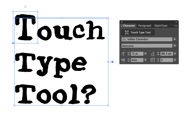
A screenshot of the new "Touch Type Tool" in action. I made the letter T bigger and changed it's horizontal scale.
I was playing around in Adobe Illustrator CC and came across a giant button labeled "Touch Type Tool" at the top of the character palette.
Using this tool you can easily select a character from a line of text and change it's size, horizontal and vertical scale and location in relation to the rest of the text. And you can make different changes to every single letter. I suppose the benefit is that you can still edit the text, but I'm having a very hard time figuring out when you should use it. Maybe someone needs to make fancy drop caps that are stretched and skewed. I'm guessing this is one of those features that looks good in a demo, but will be poorly used by inexperienced designers everywhere.
It's also very poorly named. To me, "touch typing" is what I was taught in keyboarding class in high school. At least you can hide the giant button with the "Show Touch Type Tool" option in the flyout menu.
In general, I really like Creative Cloud and there are some genuinely useful new features. I'll try to pull together a more detailed post with some of my favorite new features. But don't expect to see "Touch Type Tool" on that list.
I’m always looking for ways to be more organized. I recently cancelled my 37 Signals Backpack account. I liked Backpack and used it for many years, but recently they have decided to stop development on the product and I just haven’t been using it enough to continue paying for the service. And Basecamp — even though I love it — is overkill for my personal needs right now.
When I started using Backpack, I used it for to-do lists, to transfer files between the office and home, making notes and keeping track of bookmarks. Over time, other services took over features I had originally used in Backpack.
Dropbox took over the file transfers. I love Dropbox and couldn’t imagine my workflow without it. So elegant and effortless. I have gotten by with the free version, but really should upgrade to the paid version simply because I love the service so much. If you don’t have a Dropbox account, you are completely missing out.
There are lots of good task management apps on the market, but I needed something that would sync easily between my office Mac, laptop, iPhone and iPad. Flow is an online app with a companion iOS app and has become my go to for keeping track of projects and to-do lists. At $10 a month, it’s not cheap but is well worth the investment.
I started using Google Reader to organize all the RSS feeds for blogs and sites that I read regularly. I’m not fond of the Google Reader web interface so I use Reeder for Mac and iOS for reading articles.
I still needed to find a service for keeping track of bookmarks and notes. I’ve tried lots of services over the past year and I eventually settled on Evernote.

I first tried Evernote several years ago. And I didn’t like it. But recently, I gave it another shot and this time, it worked for what I needed.
Evernote is a web app that allows you to save notes and websites, organizing them into Notebooks. They have native apps for iOS, Mac and pretty much every other platform. Plus extensions for browsers that allow you to easily add pages to your Evernote account.
For websites, I just use the web clipper extension. And Reeder has the ability to send any story I read in the RSS feed straight to Evernote.
I often want to save tweets with links or photos. Most Twitter clients give you the option to email tweets so I email them to my dedicated Evernote email address. (You can easily add it to your contacts on the iOS and Mac versions.) I actually end up doing this quite a bit when I’m on my iPhone.
I set up an “Inbox” Notebook that I throw everything in. And then sort the notes into appropriate categories when I get a chance. Kind of like Inbox Zero.
I’m just starting to look at other ways to get notes and comments into Evernote. Evernote offers an app called Skitch that lets you add pictures and comments to your Evernote account. Squarespace’s new Note app lets you add notes straight to Evernote (plus Squarespace, Dropbox, Twitter and Facebook). Moleskine even sells an Evernote edition that you can use to catalog your sketchbook creations and even use labels to tag content.
Evernote has a section of the site called The Trunk dedicated to apps and solutions that work with Evernote. There are quite a few interesting solutions out there.
I haven’t upgraded to the Premium service yet ($5 per month or $45 per year). Most of what’s included is more than I need, but Notebook sharing is interesting to me. I could see sharing home ideas with my Pinterest-obsessed wife or project notes with other creatives.
Most designers I know can probably count on one hand the number of times they’ve opened Adobe Bridge. But Bridge really does have some useful tools. One of my favorite uses for Adobe Bridge is selecting a series of pictures and creating a customized proof sheet.
I’ve seen people try to do this in InDesign and Photoshop, but with versions 5 and 5.1, Bridge makes it incredibly simple and provides lots of options.
Open Bridge and go to the Output Tab in the upper right. Finding the folder with your images on the left. You’ll need to select the specific images you want included from Content section in the bottom center. All images you select will appear in the Preview section in the top center.

Your proof sheet can include bitmap images (jpg, tif, png, gif and more), vector images (.eps), PDF files and even native Adobe files (.indd, .ai and .psd). Of course, the documents with multiple pages will only show the first page in the proof sheet.
To the right of the window is the Output tab with two options, PDF and Web Gallery. Select PDF and look at some of the default templates. 2x2 Cells will give you four pictures per page. 4x5 Contact Sheet will give you 20 per page. Click the Refresh Preview button and a preview will appear in the middle of the screen.
To generate the PDF, go to the bottom of the Output palette and press the Save… button.
 Let’s say you want to customize your proof sheet. Bridge provides many options. (Just look at the screenshot of the entire Output Panel to the right.) The interface is divided into several sections:
Document - Change the size of the paper, resolution of the images and background color. Plus you can add a password to the document.
Layout - Change how the images are placed, how many columns and rows, the spacing between the images and more.
Overlays - Determine how the filenames are displayed and add page numbers.
Header and Footer - Two separate sections to add text to header and footer areas, set their dimensions and customize the appearance.
Playback - Want your PDF to open in Full Screen Mode and have transitions like a a PowerPoint presentation? Set it in this section.
Watermark - Add images or text as watermarks, either for individual images or for the entire page.
By combining several of the options, it’s possible to add a company logo to your page and then save it for future use.
Go to the Watermark section and select Add Watermark. Select Insert Image: and select the path for your logo. By default, the logo will be placed in the middle of your page, which you probably don’t want. Change the size and placement of the logo with Scale, Horizontal Offset and Vertical Offset sliders.
You may also want to customize your header and footer to add other details. I’ve added a title in the header and a copyright statement in the footer.
Remember that you can hit the Refresh Preview button at the top of the page to see a sample of your proof sheet.
Once you have it exactly the way you want it, look back to the top of the Output palette. Next to the template list is a new page icon and a trash can. Click the new page icon to save your design as a template. (And if you want to delete one, you guessed it, click the trash can.)
 Thumbnail of custom Sketchbook B proof sheet.
Next time you need to make a proof sheet for a client, select your template and click Save… at the bottom.
If you want to see how the various elements can be combined, check out this PDF sample of my Sketchbook B proof sheet showing some of my Flare effects. I’ve included my logo in the upper left, changed the typeface to SBB Periodic and added a title at the top of the page.