What’s the deal with the blue underlines in InDesign 2015?

InDesign is trying to help.

One of the benefits of Adobe’s Creative Cloud subscription system is that new software and features can arrive at any time. The downside is that a confusing feature can arrive at any time, as well.

One day, when I selected a word in InDesign, an odd blue line appeared on the first letter. I was confused for a second until I realized it was a new feature intended to access OpenType alternate characters. OpenType can be confusing and so I applaud Adobe for trying to make alternates more accessible. But it took me a few minutes to figure out how it worked, because the behavior changes based on what you select. (If you want to try it out yourself, select an Adobe Pro font… For this demo, I chose Adobe Caslon Pro Italic.) 

Here’s what happens:

When a word is selected, the first character with an alternate will be highlighted.

You select a word. The first letter of the word with an OpenType alternative will be highlighted with a blue underline. In most cases, that’s the first letter. In some cases, it may be the second or third letter. If you click on the underline, you will see your OpenType options underneath it. If there are more than five alternates, then you can click the arrow on the right to open the Glyphs palette and see all your options. It’s important to note that if you select a word, only the first letter with an alternate will be highlighted, even if other letters in the word have alternates available.

 
Select a paragraph and no blue underlines will appear.

You select more than a word. The blue line will not appear for any character.

 
Select a character anywhere in the word and see the alternates available.

You select a single character anywhere in the word. You see all available alternates for that character.

I suppose this is helpful for discovery. With Adobe Caslon Pro Italic, many of the available alternates are superscript letters, patterns or dingbats. In most cases though, I think it’s still easier to access OpenType features from the flyout menu on the Character palette. 

If you just find the blue line annoying, it’s easy to turn off. Just go to Preferences > Advanced Type > Type Contextual Controls and uncheck both options.

Or just get rid of the blue line by unchecking the Type Contextual Controls options.

Bob Wertz writes about design, technology and pop culture at Sketchbook B. Bob is a Columbia, South Carolina-based designer, creative director, college instructor, husband and dad. He’s particularly obsessed with typography, the creative process and the tools we use to create. In his spare time, he digs through the preferences of InDesign looking for helpful features. Follow Bob on Twitter and Instagram.

Creative Spelling

If you’re like me, your clients have all sorts of brand names, executive names, cities and URLs that give InDesign’s spell check fits. But you don’t have to just click “skip” repeatedly during a spell check. Add these to the user dictionary.

Pull up the user dictionary by going to Edit > Spelling > User Dictionary… and add your terms here. If you want a name or URL to be case sensitive, check the case sensitive box.

This is particularly helpful for URLs with creative capitalization. If I want “sketchbookb.com” to always be “SketchbookB.com,” I add “SketchbookB.com” to the dictionary and check the case sensitive box. Now if I type “sketchbookb.com” somewhere, spell check will recommend “SketchbookB.com” instead.

Bonus tip: Using the import and export buttons, you can share your user dictionaries with your coworkers. 

I post quick tips for InDesign and other Creative Cloud apps on Wednesdays.

Hidden alignment

When you open the Align palette in InDesign, you have two groupings: Align Objects and Distribute Objects. But a third option is hidden in the flyout palette: Distribute Spacing. And I find it far more useful than Distribute Objects.

To find the hidden option, go to the flyout menu on the Align palette and select Show Options. Now, you'll have a palette with another row of options for Distribute Spacing.

Let’s say you have five rectangles of different widths. Something like this:

You want to change the spacing between them. If you select them all and click the “Distribute horizontal centers” button in the Distribute Objects section. The result would look like this: 

If you select the same rectangles and select the now uncovered “Distribute horizontal spacing” button in the Distribute Spacing section, you get this:

I find that most of the time, I’m looking for the hidden Distribute Spacing option. I have no idea why Adobe would hide that function and I’m always surprised how many InDesign users – some of them very experienced users – have no idea that function is there. It’s a big time saver.

Bonus tip: If you need a specific distance between a group of items, check the “Use spacing” option, set your distance, click the horizontal or vertical Distribute Spacing button and it’s done.

Sketchbook B's Wednesday Creative Cloud Quick Tip is back. You can find all of the previous tips over here.

Grouping Colors in InDesign CC 2014

The new versions of Creative Cloud are out, and InDesign has picked up a few new features. One of the minor tweaks will be really welcomed by obsessive compulsive designs.

InDesign CC (2014) now lets you group your colors into folders. Just click the folder icon at the bottom of the Swatches palette to make a new color group.

While it's a small thing, having the ability to group colors will be helpful or large and complex documents.

Every Wednesday, I post a tip for an Adobe app.

Measure twice...

InDesign has a built-in ruler – the Measurement tool that hides behind the Eyedropper. You can use it in a couple of ways.

Select the Measurement tool and draw a line to measure something. The Info palette should open. Your measurement results will appear in the Info palette.

Below, measuring the left side of the magenta box, you can see the length (D1) and the angle. Also note that the width and height of the shape, the coordinates and the colors are also shown in the Info palette. And once you've drawn a measurement line, you can move it around to compare to other shapes.

Distance and angle is easy to find.

Distance and angle is easy to find.

But that's not all. You may need to measure the angle between two lines. If I want to measure the angle between the pink and black boxes, InDesign has a hidden "protractor" measurement mode. Draw your first line. Then, holding down the option key, draw a second line that starts at the endpoint of the first line. Your cursor should change into a protractor that looks suspiciously like a compass. When you draw both lines, your measurements for the first line (D1), second line (D2) and the angle between them is shown.

Protractor measurement mode in action.

Protractor measurement mode in action.

Oddly, this ruler is more capable than the one in Illustrator where I would use it more often. The Illustrator measurement tool lacks a protractor mode. Seems like it would be an easy addition for them. (And if Adobe really wanted to improve the ruler in their apps, they should take some tips from the type design app, Glyphs, which has an amazingly functional measurement tool.)

Every Wednesday, I post a quick tip on an Adobe app.

InDesign's hidden distraction-free writing mode

I’m a big fan of distraction-free writing environments that strip away all of the formatting and let you focus on the words. (I normally use Byword for iOS and Mac.) What does this have to do with today’s quick tip? Adobe InDesign has a built-in, distraction-free editing mode.

It’s called Story Editor and it’s helpful when you are trying to edit text without the formatting. To activate it, select a text box and go to Edit > Edit in Story Editor. A simple window will open that looks like this:

The default Story Editor in InDesign.

The default Story Editor in InDesign.

Any text changes you make in the Story Editor are also made in the InDesign layout. It's just a different view of your story.

To the left you have the Paragraph style and a ruler showing how many inches of text you’ve written. The ruler takes into account the type style and width of column to give you an accurate estimate of how long your text is. If you don’t find them helpful, you can disable them by going to View > Story Editor and hiding them.

Also, I’m not a big fan of the type settings. Thankfully, you can change the appearence in InDesign > Preferences > Story Editor Display... Change the typeface, size, background colors line spacing and more.

With some tweaks to the interface, the Story Editor now looks like this:

Slightly customized Story Editor.

Slightly customized Story Editor.

In a perfect world, Adobe would include some other options. Personally, I'd like to be able to adjust the width of the side margins so can take the window full screen width and still have an easily readable line length. As you can see from the shot above, the text goes all the way to the edge of the window.

It's not going to replace Byword for me, but it is a nice option when editing text in InDesign and really helpful with complex documents.

Every Wednesday, I post a quick tip on an Adobe app.

Find anything. Change anything.

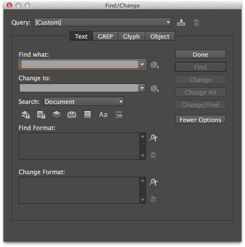
The Find/Change feature of InDesign is ridiculously powerful. Most people only use a fraction of its capabilities. There are four types of searches: Text, GREP, Glyph and Object.

The text find/change dialog is the only thing most people see, but there is more power lurking underneath those other tabs.

The text find/change dialog is the only thing most people see, but there is more power lurking underneath those other tabs.

A Text search is most common. Find a certain word or phrase and replace it with another. But by using the boxes at the bottom of the screen, you can also search by how the word is formatted and replace with a different format.

The GREP find/change in much more complex. It searches for patterns. So if you want to find all phone numbers in a document and format them the same way, GREP search is for you.

A Glyph find/change lets you isolate a specific character. Helpful for locating or altering of random bullets.

Using the Object tab in the Find/Change dialog box, you can restyle an entire document quickly.

Using the Object tab in the Find/Change dialog box, you can restyle an entire document quickly.

But the Object tab is the one that gets the least attention and it's the most powerful. Find and change the formatting on shapes, lines, text boxes and more. Find all boxes with a 1 pt. line and replace with a 2 pt. line. Find all shapes with a drop shadow and remove them. Powerful stuff, and most people have no idea it's available to them.

If you are working with long documents, Find/Change will save you a ton of time. 

Every Wednesday, I post a quick tip for an Adobe app.

Everyone wants more white space

InDesign offers 14 different types of spaces. Just go to Type > Insert White Space... A very old post on Adobe's site explains the differences. I don't use them very often. For me, the Thin Space, Nonbreaking Space and the Figure Space can be quite helpful. It's nice to know they are there.

Every Wednesday, I post a quick tip about an Adobe app.

Better spacing or fewer hyphens

Hyphenation can be critical when you're trying to justify text. Below is a passage with three hyphens:

Screen Shot 2014-04-29 at 9.39.24 PM.png

Lots of people hate hyphens and might ask you to turn off hyphenation. That's a bad idea because then it will look like this:

Screen Shot 2014-04-29 at 9.40.55 PM.png

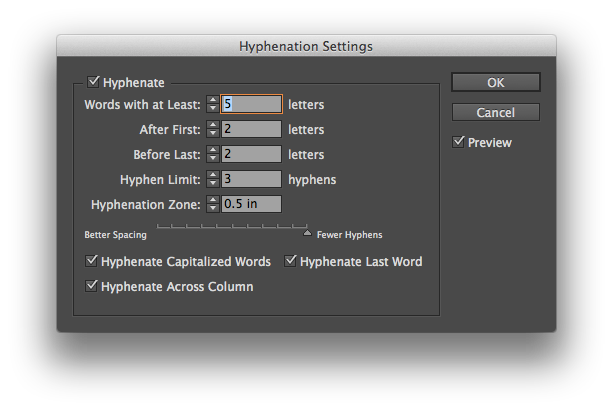
That's some bad spacing. Thankfully, InDesign offers a better way to control hyphenation. Go to the flyout menu on the Paragraph palette and choose "Hyphenation..." A dialog box will pop up:

Screen Shot 2014-04-29 at 9.41.50 PM.png

InDesign checks the entire paragraph and decides the best locations for hyphenation based on your settings. Look for the slider at the bottom of the box. On one side, you have "Better Spacing" and on the other "Fewer Hyphens." Choosing the "Fewer Hyphens" side will only leave the hyphens that InDesign needs for proper spacing. Below is the same passage with "Fewer Hyphens" selected.

Screen Shot 2014-04-29 at 9.41.57 PM.png

InDesign eliminated one hyphen and changed the hyphenation on "coordinate" to maintain good spacing. I usually adjust the settings with the "Preview" box checked so I can see the changes as I move the slider. 

Just know that you have more hyphenation options than "on" and "off." 

Every Wednesday, I post a tip on an Adobe app.


Align strokes

In the middle of the Stroke palette are the Align Stroke options.

In the middle of the Stroke palette are the Align Stroke options.

InDesign lets you determine where the stroke is located on a box or shape. In the middle of the stokes palette is the "Align Stroke" option. By default, the stroke is centered on the path. So a 2 point line with have 1 point outside the box and 1 point inside the box. 

With thicker strokes, the placement of the stroke really matters. Below are three boxes that are drawn to be exactly the same size. The only difference is the alignment of the stroke.

These three boxes are the same size. Only the alignment of the stroke varies. From left to right: Inside, Centered, Outside.

These three boxes are the same size. Only the alignment of the stroke varies. From left to right: Inside, Centered, Outside.

It's helpful to use these settings when you are trying to get precisely measured shapes. I use the inside alignment option all the time.

Every Wednesday, I post a quick tip on an Adobe app.

Star command

Stars and polygons are easy to build in InDesign. Most people, myself included, set the angles and number of sides by double clicking on the Polygon tool. Which brings up a dialog box allowing you to set the number of sides and star inset percentage.

Screen Shot 2014-04-15 at 11.00.05 PM.png

But let's say you want to change the number of sides or the star inset angle while you are drawing the shapes? Easy. Start to draw the shape. Press the spacebar and then use the arrow keys to adjust the shape without opening the dialog box. Right and left arrows change the angle of the star inset. Up and down changes the number of sides.

But here's the really awesome tip. Start to draw a star or polygon. Don't push the space bar like you did above. Simply push the arrow keys right or left. InDesign creates a horizontal line of identical shapes. If you use just the up and down arrows, the shapes form a vertical line. Or use both sets of arrows and create a grid of shapes. 

Even better, the grid tip also works on rectangles and circles, too. It's magic.

A couple of rows of shapes created with the arrow keys.

A couple of rows of shapes created with the arrow keys.

A grid of circles created using the arrow keys while drawing.

A grid of circles created using the arrow keys while drawing.

FYI: The spacebar acts like a toggle. So you can easily switch between the two modes.

Every Wednesday, I post a quick tip for an Adobe app.

Customizing an underline

I don't typically underline much. I usually don't like the default thickness of the line or the positioning. But in InDesign, you can completely customize your underline styles.

To change the appearance of an underline, select some text. Go to the flyout menu on the far right of the Control palette. (That's the wide palette docked by default underneath the menu bar.) Choose "Underline Options...." from the menu to pull up a dialog box:

Change the weight, stroke style, positioning and color of the underline.

Change the weight, stroke style, positioning and color of the underline.

You can easily change the appearance of the underline – the thickness, positioning, color, stroke style and more.

Two additional tips:

  1. If you have created a custom stroke, you can use it as an underline too. (See last week's tip for how to create a custom stroke pattern.)
  2. You can save "Underline Options" in a paragraph style to apply it throughout your document. And you can save style sheets and load them into other files.

Every Wednesday, I post a tip on how to use an Adobe app more efficiently.

Custom strokes in InDesign

Need to build a custom stroke in InDesign? Easy. Go to the flyout menu on the Stroke palette and choose "Stroke Styles..."

A dialog box will open with several options and a list of custom strokes. Choose "New..." to get the stroke editor. You can make dashed, dotted or lined patterns, change the length and pattern of the stroke and preview your designs at different weights.

InDesign provides lots of options for designing custom strokes.

InDesign provides lots of options for designing custom strokes.

The custom strokes are saved on a document level, but you can save your designs and load strokes into other documents. If you want a custom stroke to be added to all new documents by default, simply add the stroke with no documents open.

Every Wednesday, I post a quick tip for an Adobe app.

Vignetted colors and photos in InDesign

The most visited post on Sketchbook B is a 5-year-old tip for InDesign CS4 on how to create a simple vignette effect within InDesign. I decided to update it with some additional approaches.

Stacked option for solid color blocks

Start with two identical shapes. Make one darker than the other. Select the lighter image and apply a basic feather effect (Object > Effects > Basic Feather... or via the Effects palette). You can experiment with the corner style, size of the feather and noise. Place the lighter colored shape on top of the darker one to get the vignette effect.

Place the lighter shape on top of the darker shape to get the vignette effect.

Place the lighter shape on top of the darker shape to get the vignette effect.

One important reminder: You can't do this with spot colors. For it to reproduce consistently, you'll need to use process colors.

Stacked option for pictures

Now for a twist. Want to add that Instagram-like vignette effect to a photo without opening Photoshop?

You'll need three boxes: two identical boxes containing your image and one with a black fill. Apply a multiply transparency to the black box. And apply the basic feather to one of the picture boxes. And stack them:

Three boxes to make a vignetted image. Here, the black box has a 75% multiply transparency.

Three boxes to make a vignetted image. Here, the black box has a 75% multiply transparency.

The full image should be on the bottom. Then the black box. And the feathered image is on top. You can experiment with the transparency and blending mode to get the right effect.

Using inner glow instead

InDesign has an inner glow effect. Simply select your color block or photo and apply the inner glow effect (Object > Effects > Inner Glow... or via the Effects palette).

Set the color to black and the blending mode to multiply. You can play with the color, size and noise settings to customize the effect. The end result is something like this:

So if using the inner glow is so much faster, why not use it exclusively? Stacking gives you a slightly different effect. I prefer the stacking approach for large blocks of color and the inner glow for photos. But in the end, it's personal preference.

Every Wednesday, I post a quick tip for an Adobe app.

Keeping colors in proportion

In InDesign, you want to modify a color slightly, keeping it in the same basic hue. Maybe you've duplicated a color and need a slightly lighter or darker color to complement your design. You double click the swatch in the palette and you get this:

Moving the sliders individually will radically alter the color. You need to move all the sliders at once, keeping them in proportion. And InDesign has a way to do this. Simply hold down the shift key as you click and drag the sliders. They will all move together:

Look at the numbers in the screenshot above. I simply clicked on the Cyan slider and moved it to the left while holding down the shift key. All of the sliders moved in proportion. Cyan went from 72% to 62%. And the other colors moved, too. Here's another screenshot where I've moved the Cyan slider to 52%:

And the same trick works in Illustrator, too. Just hold the shift key to move the Color palette sliders together. It's a simple and powerful way to adjust your color palette.

Every Wednesday, I post a quick tip for an Adobe app.