
Better spacing or fewer hyphens
Hyphenation can be critical when you're trying to justify text. Below is a passage with three hyphens:

Lots of people hate hyphens and might ask you to turn off hyphenation. That's a bad idea because then it will look like this:

That's some bad spacing. Thankfully, InDesign offers a better way to control hyphenation. Go to the flyout menu on the Paragraph palette and choose "Hyphenation..." A dialog box will pop up:
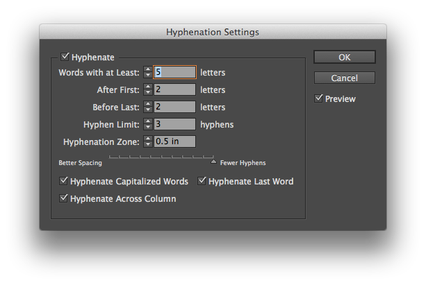
InDesign checks the entire paragraph and decides the best locations for hyphenation based on your settings. Look for the slider at the bottom of the box. On one side, you have "Better Spacing" and on the other "Fewer Hyphens." Choosing the "Fewer Hyphens" side will only leave the hyphens that InDesign needs for proper spacing. Below is the same passage with "Fewer Hyphens" selected.

InDesign eliminated one hyphen and changed the hyphenation on "coordinate" to maintain good spacing. I usually adjust the settings with the "Preview" box checked so I can see the changes as I move the slider.
Just know that you have more hyphenation options than "on" and "off."