
The Curious Case of the Missing Apple Logo
Two notable logo trends from Apple
Apple has one of the most recognizable logos in the world. Which isn’t surprising because they are the largest company in the world. I’ve been watching a couple of trends over the last few months about how Apple uses their logos and this week, those trends have become even more apparent. For brand managers and designers, I think there is something interesting going on and it’s worth digging into the mystery.
The logo is “missing.”
Apple isn’t afraid to use their logos. All of their computers have prominent logos. They include logo stickers in all of their boxes. Apple’s logo is everywhere. But on their new iMac, which was released this week, Apple’s logo is on the back, but not on the front. The last few generations of iMac’s have featured a prominent logo on the back and a second logo on the “chin,” facing the user. The new iMac has no user facing logo.*
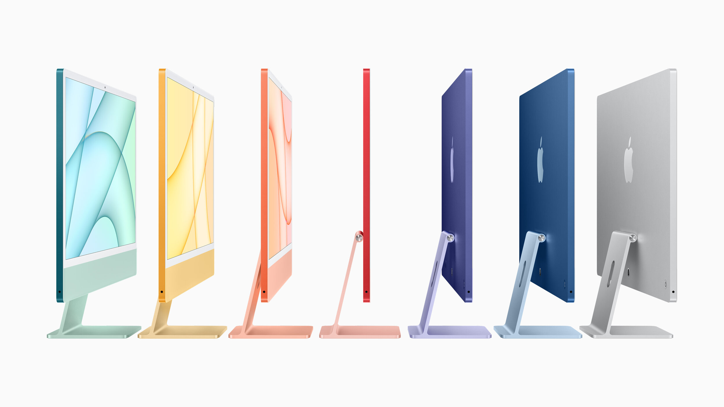
The new iMac doesn’t have a logo on the front, but still sports a prominent mark on the back.
But the iMac isn’t the only recent Apple product with an interesting logo story. I first noticed Apple’s changing logo use with the introduction of the AirPod Max, which has no Apple logos at all on the product. There is plenty of room for a logo on the side of the headphones, but there is none to be found.

A large space for a logo… but there isn’t one.
I guessed the AirPods Max was the only Apple product without a logo, but I was wrong. For some reason I assumed that my AirPods case had the Apple logo on it, but guess what? It doesn’t. I checked Apple’s website and the AirPods Pro don’t have a logo either. (Although according to Apple’s website and an iFixit teardown, the chip inside the AirPods Pro has a tiny logo printed on it.) My Apple Watch has a tiny Apple logo on the bottom on it, but it’s not visible when it’s being worn. Apple doesn’t include logos on any of their wearable products.**

A promotional image from Apple of Apple Fitness+ trainers. I count five Nike logos.
But that’s not all. I’ve been trying out Apple Fitness+ and there are tons of visible logos. Nike logos. All of the instructors seem to be wearing Nike gear. There are no Apple logos. No special Apple Fitness+ shirts. No little Apple “watermark” in the corner of the screen. An Apple logo isn’t hidden somewhere on the set.

AirPod competitors, with prominent logos on the case or the earbud itself.
I checked Apple’s competitors. Amazon, Samsung and Microsoft all include their logo on the charging case for their AirPod competitors. Sony and Google even managed to get their logo on the earbud itself. None of the competing smartwatches that I looked at had logos, although Samsung etched “Galaxy Watch” into the crown for some reason.
In the fitness space, Peloton employees sport logo apparel while they lead classes. And the instructors on Nike’s fitness apps obviously sport Nike gear.
So what’s going on? I’m not sure.
My first reaction is it’s just an issue of taste. Placing logos all over a product is tacky — especially for wearables. And Apple is showing their superior taste by acknowledging that consumers don’t always want to be sporting company logos. Maybe? But lots of premium and luxury brands include logos on their products. And Apple isn’t exactly shy about using their logo.
It’s not about the logo size. Even the Apple Pencil has a logo. And as I mentioned, the chips inside the AirPods have logos printed on them. (The chips… inside the case… that the consumer never sees…)
The absence of a logo is even stranger when you realize the original intent of a trademarked logo: to clearly identify the manufacturer. With a company like Apple, whose designs are ripped off more than about any other tech company, their logo is the part of the design that absolutely can’t be legally copied.
My best guess is that Apple thinks that their product designs are unique enough, that they don’t even need a logo. People will know AirPods are an Apple product when they see them. The Apple Fitness+ workouts feel like Apple even if their logo isn’t present. I don’t think any other company can make a desktop computer that looks like the new iMac. Apple’s presence is understood because of the overall production quality and design. A logo isn’t necessary.
The logo is “incognito.”
Typical corporate logo standards are incredibly strict. Apple doesn’t publish their internal brand guidelines, but it’s clear they do allow some more playful uses of their mark. For example, they often use illustrated versions of their logo to promote their media events, like they did for this week’s Spring Forward event. Allowing logo variations in large corporate identity systems isn’t uncommon, but those variations are typically used for structural identifications between organizational divisions or product lines.
But Apple is using logo variants that align with their values.

Apple’s environmental logo version, on Earth Day.
In 2014, Apple started using a logo with a green leaf in their retail stores on Earth Day. This logo seems to be used mostly in Apple retail, but showed up this week on the Apple home page for Earth Day 2021 and their updated environmental statement.
Apple’s Privacy logo version is probably the most used of their variations.
And in this week’s presentation, they showed their privacy Apple variation, which is often animated and turns the leaf at the top of their logo into a lock. It’s used in ads, videos and sites when Apple is talking about their commitment to privacy. What’s smart about this approach is that Apple is using their logo to not just communicate their identity, but also their corporate values.
(It’s worth noting that there are a couple of other logo variants as well: a gift that is used during the holidays and a version for their Marina Bay Sands retail store in Singapore. And I’m sure there are others as well.)
What lessons can we take from Apple’s approach to logo management?
Apple’s visual branding is clearly effective. Repetition and consistency are the foundation of contemporary brand management, but Apple has decided to not use their logo in some places and change it in others. This ongoing shift in logo usage isn’t accidental or ill-considered. A couple of lessons to think about:
Everything doesn’t need a logo. In the 1990s, branding meant putting the logo on everything, but is it really necessary? (It isn’t.) Logos are important, but they aren’t the only way you communicate your identity. Apple’s using their logos smartly, and not over using their marks.
Differentiation happens with the design around the logo. Apple’s products are identified by their look and feel. Yes, the logo is part of that, but Apple’s visual branding extends far beyond just their logo. Their brand is expressed as much through the surrounding elements — type, color, materials — as it is through their logo. Their visual differentiation extends far beyond just their logo and their identity is stronger for it.
Think about how a visual identity can reflect a company’s values. Most of the time, visual identity reflects an organization’s structure, but connecting your visual brand to your corporate values is potentially more powerful. Apple uses logo variations that support their beliefs, not their hierarchy.
We’ll never hear from their branding team and Apple doesn’t publicly share their logo and branding guidelines. We’ll just have to watch as they rollout ads, events and products. But it’s clear that Apple is diverging from the standard brand playbook here and I think we should pay attention to where they go next.
* Unless you count the logo on the Magic Mouse.
** With the exception of AirTags. I’m not sure if I count those as “wearables,” though.
Bob Wertz writes about design, technology and pop culture at Sketchbook B. Bob is a Columbia, South Carolina-based designer, soon-to-be Ph.D. student, researcher, college instructor, husband and dad. He’s particularly obsessed with typography, the creative process and the tools we use to create. Bob occasionally and begrudgingly posts to Twitter and Instagram. He wears a mask and got vaccinated to protect his community. #TeamModerna