Photo-Lettering from House Industries

When Andy Cruz from House Industries came to speak to AIGA South Carolina in 2005, over dinner, he mentioned House Industries was looking at the idea of developing a system where designers could set a headlines online and pay a small amount to download an EPS file.

Last week, they finally launched the service. Photolettering.com is a service where you can customize small bits of copy and for $7 each, download the settings in EPS format. The service leverages the old Photo Lettering, Inc. library that House purchased a number of years ago and adds a few of their original creations. Each type design has a range of options and you can customize the colors. House plans on adding addition typefaces in the future.

You can also subscribe to the service if you plan on using it frequently. (I’m not sure who is going to use 1,000 settings a month for $1,000, but I’m sure someone will.)

One interesting note: The license is very reasonable. No restrictions about usage in logos or high quantity materials. You can use the settings for any purpose with two exceptions. You can’t use the letters to reverse engineer a font. And you can’t create products for sale that are based solely on the letter forms.

$7 for a setting is definitely reasonable. It will be interesting to see if this type of service catches on among designers.

FontStruct on iPad

I love my iPad. And I really don't care about the fact that iOS doesn't support Flash. With one exception... I'd like to run FontStruct on my iPad.

The other day, I found iSwifter for the iPad. It's essentially an alternate browser that allows you to open websites with Flash. It's "free" to try, but if you want to use it for more than a few minutes you have to pay $0.99.

And using it, I was able to open FontStruct on my iPad and create a typeface. It's slow - really slow - but it works. The real problem is that FontStruct isn't designed for a touch interface. The controls are too small. And it's very hard to be precise. After creating a few characters, I gave up. For FontStruct to work well on iOS - or any tablet - it's going to need an interface redesign. It's more than simply supporting Flash.

So I'm still waiting for FontStruct on my iPad (and I'm very willing to pay for an iOS app.)

Typographic Taunting, 2010 Edition

Last year, after South Carolina beat Clemson, I built a quick font based on South Carolina’s Block C logo. I called it Scoreboard and included a glyph that had the SC-Clemson score for the 2009 game. Well, after South Carolina once again beat Clemson on Saturday, I decided to update the font with this year’s score. (I previously had added the USC baseball team’s national championship score this summer, but never posted about it.) Anyway, download Scoreboard for free at Fontstruct…


Congrats to the InShow 16 winners

InShow is AIGA South Carolina’s annual design competition and pulls together the best work from around South Carolina. This year, I only entered one thing into the competition as Sketchbook B and wasn’t shocked when it didn’t win…

As I looked at the incredible collection of work, I was surprised to find Sketchbook B included as a credit on one of the winning entries. My friend Marius included Sketchbook B as a “typeface design” credit on his Unwantables Package Design that used Valdes Poster Sans, the typeface that we developed together. The piece was even selected as a special judges award. So congrats to Marius and thanks for including Sketchbook B on the entry. 

I encourage you visit the InShow site and look at the winning entries. There was some amazing work “in” this year. Check out Marius’s amazing (and massive) collection of work at Zoo Valdes. And remember that you can download Valdes Poster Sans for free here at Sketchbook B.


Launching Alliance

Today, I’ve posted new typefaces, Alliance Standard and Alliance Stencil, in the Download Fonts section. And I’ve also made available 4 additional typefaces over at Fontstruct: Alliance Dot Five, Alliance Dot Seven, Alliance Pixel Five and Alliance Pixel Seven.


Alliance and Alliance Stencil

Alliance is an odd experimental typeface. And it’s one I’ve worked on sporadically for a long time. It started as a series of sketches centered around the concept of a modular science fiction stencil system. Alliance is somewhat inspired by Joss Whedon’s Firefly and the inefficient bureaucracy of the ruling government, the Alliance. Building a modular stencil system where the stencil pieces come together at a 45 degree angle seemed like an inefficient concept. However, the result is an odd set of letterforms with a unique structure.

There are nine stencil shapes that can be combined to make the characters. The dots in the middle were added when I realized that you would never be able to line up a stencil system like this without some sort of guide.


Dots and Pixels

I built Alliance’s modular stencil system before I discovered Fontstruct. I liked the basic letterforms and saw opportunities to expand the concept with Fontstruct. So I translated the design into two of science fiction’s favorite type cliches: dot matrix and pixels. And then, I did nothing with it. 

Limitations

I finished the design, but never released it. While I was happy with the general structure, I was unhappy about the limitations of the typeface. Punctuation was a problem. Should I build out a full character set or only the characters that could be built using the system? Stylistically was it too limiting? Was it even worth finishing? Should I scrap the whole thing and start from scratch?

As I took my time finishing it, I adopted many of the concepts for some of my other Fontstruct typefaces. Power Grid, Transmission, Cereal Box and Technobabble all take cues from some of the letterforms in Alliance. But Alliance sat unreleased.

Finishing up

A few months ago, I came across some of my original sketches. And I decided to finish Alliance. In an effort to make it usable, I made some compromises on the system for some punctuation. However, it does not have a full character set.

You can download Opentype versions of Alliance Standard and Alliance Stencil from the Download Fonts section here at Sketchbook B. And you can download Dot Five, Dot Seven, Pixel Five and Pixel Seven over at Fontstruct.

Review: iFontMaker for the iPad

Can you design typefaces on an iPad? When the idea of a mythical Apple Tablet was floating out there in Rumorville, it occurred to me how great it would be to use Fontstruct on an iPad. But alas, no Flash support means no Fontstruct on the iPad. 

So I waited. A few weeks ago, I got a note from my friend @jamesmiller telling me about a new app that allows you design type on your iPad… Intrigued, I downloaded and started playing around with it.

iFontMaker is an application by 2TTF that allow you to design fonts on your iPad. 2TTF boasts that you can make a basic font in five minutes…

How it works

With iFontMaker, you draw out the letters with your finger. You can choose from four brush types - brush, pen, pencil and line segment. You can set guides for the baseline, x-height, cap-height, ascenders and descenders. New in version 1.5 is a nudge tool that allows you to reshape strokes. And the move tool was updated to allow rotation and movement of individual strokes.

The application has two tabs: Glyphs and Compose. Glyphs is where you draw the characters. Compose is where you can view and create test samples. (You can also adjust the global letter spacing under the Compose tab.)

Screenshots of iFontMaker. Left, main glyph editing interface. Right, editing a path with the move tool.

When you are done with your creation, you upload the design to their servers. They generate the font and post a sample page with a download link. (Check out the sample page with my designs SquarePad and LilyPad.)

It really is very easy to create a font this way. And I imagine their 5 minute estimate is probably correct. But there are some significant limitations…

Limitations

The app is simple to use, but that comes with tradeoffs.

Character Width. My main issue with iFontMaker is that there’s currently no way to adjust the width of individual characters. This creates some problems with more complex designs. I’d love to be able to adjust a right side bearing to address spacing issues. But right now, you can’t.

Not precise. It’s impossible to be precise with the touch screen interface. Version 1.5 adds a straight line tool, but it’s still somewhat clumsy.

Revising is very difficult. In an effort to keep the interface simple, there are limited editing capabilities. Version 1.5 allows you to move strokes around. And you can scale glyphs using the pinch/zoom multitouch gesture. But there is no eraser. And the nudge tool seems very difficult to control. Basically, if you aren’t happy with the glyph you’ve drawn, your best bet is often to erase it and start over.

Pan and Zoom. There is no way to zoom out or pan around the canvas. This isn’t a problem for most characters, but for some characters with accent marks, it’s difficult to add them above the letter without the ability to zoom out or pan up.

What’s Good

Despite it’s limitations, iFontMaker is fun. Lots of fun. And it also gets a lot of things right.

Support for a large character set. iFontMaker allows you to build fonts with large character sets in many languages including Japanese, Greek, Cyrillic and Thai. Great support out of the gate and the developers indicate that they are willing to add more.

The upload process. When you upload your font to 2TTF, they provide a nice display page and a link to download. But they also provide a link to a web font file. Really nice idea and it works pretty well.

The guides. I like the way the app allows you to set your x-height, ascenders, descenders globally. It’s a detail that very easily could have been overlooked. I only wish I could set the character width on each individual character.

A couple of samples

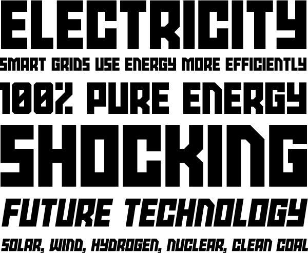
I created a pair of fonts with iFontMaker: SquarePad and LilyPad. Both fonts were built quickly. Although both required a good bit of fine tuning.

You can download both designs from the 2TTF sample pages. (Note: Every time you upload a new version, you must republish the file to let others download it.) I wish the web addresses were more than just random numbers and letters, but I understand why they chose the system they did.

Is it worth $7.99 (or $6.99 on sale)?

So can you create your own font in five minutes? Yes, I think you probably could. However, it will take you significantly more time and practice to create something that you will want to use. And lots of trial and error. 

iFontMaker is a fun app. If you are interested in type or design and have an iPad, it’s definitely worth the purchase price. The developers have already provided two updates that have significantly improved the app, so I have every hope that they will continue to improve the application.

You can buy iFontMaker from the App Store for $7.99. (Although as of the publish date of this post, it is on sale for $6.99.)

Power Grid and Power Grid Oblique in Open Type

UPDATE 8/17/2014: Check out Power Grid 2.0.

Power Grid was one of my earliest Fontstruct designs. The basic concept was inspired by early 20th century constructivist designs and has a very industrial feel. I’ve recently revisited the concept and am releasing Power Grid as an OpenType font.

powergridlinesamples.gif

While converting it to OpenType, I was able to add an oblique version. Something that wasn’t really possible in Fontstruct. Hopefully, it makes Power Grid more useful as a family. (Note: Both fonts start with an SbB prefix to differentiate them from the Fontstruct originals.)

Oddly enough, Power Grid works well in both “high-tech” applications and constructivist-inspired retro designs. I’ve included some samples below that are directly inspired by some constructivist poster designs.

Three New Fonstructions: Woodrow Light, Dradis and Pseudoscript

I’ve released three new fontstructions – Woodrow Light, Dradis and Pseudoscript. You can download them for free from Fontstruct. (Note: Free registration required to download…)

Woodrow Light

One of my favorite Fontstruct creations is Woodrow. I always wanted to create a lighter version and finally got around to it. Woodrow Light is a condensed typeface. It’s intended as a display face, but surprisingly, it works well in smaller sizes as well.

Dradis

I sketched out Dradis for a logo I was working on. And while I liked the design, it was completely wrong for the client. I ended up repurposing it for a logo contest (I know, they are evil…) and lost. So I offer it up here in hopes that someone will love this oddball creation.

My own goal on this design was to maintain a degree of legibility while having no space between letters. And I wanted to keep the design as simple as possible. The resulting design uses only 6 block shapes and most of the letters are contained within a 3x5 grid.

Geeky note about the name: As the design developed, I noticed that many of the letters had slanted corners to differentiate them from their neighbors. And it reminded me of how every sheet of paper on Ron Moore’s reimagined Battlestar Galactica had the corners cut off at a 45 degree angle. So when I got ready to name the font, I looked for a random reference from the show. DRADIS is the Colonial Fleet’s equivalent of RADAR and the name seemed to fit the design.

Psuedoscript

I sketched out this basic concept while waiting in a doctor’s office. The concept was to take inspiration from something difficult to build with Fontstruct - a script. I created a version called Baseline, but after a few months, I revisited the concept and ended up with Pseudoscript. Changed the proportions. Rethought some of the letterforms. Got rid of the clumsy upper case.

And I’m pretty happy with the resulting typeface. It’s readable and distinctive. I recommend using the low line character to connect words. I’ve added some starting and ending characters as well. (Some letters look a little strange starting a word.)

New Fontstruction: Infield

Okay, so here is my entry for Fontstruct’s Sports Challenge. The challenge is to create a new sports-themed typeface. I wanted to create a baseball-inspired design and started to work with a diamond shape.

The result is Infield, a display typeface contained within the shape of a baseball diamond. The diamonds overlap and interlock to create a unique pattern.

The working title of Infield was “Baseball Diamond.” As I was working on it, the “Fabulous Baseball Diamond” popped in my head. If you aren’t familiar with the Fabulous Baseball Diamond, you need to watch the Great Muppet Caper which features Kermit and his friends from the Happiness Hotel trying to stop thieves from stealing the Fabulous Baseball Diamond from the Mallory Gallery. That finale served as the inspiration for the second sample, a poster for the fictional gallery exhibit.

You can download Infield at Fontstruct for free. And of course you can download any of my other Fontstruct creations from the Sketchbook B page.

New Fontstructions: Woodrow and Foxtrot Sierra

I’ve got two new releases over at Fontstruct, Woodrow and Foxtrot Sierra. You can download both of them for free from Fontstruct.

Woodrow

Woodrow is a very narrow and bold design. I started off planning to design something along the lines of my recent sci-fi creations. But once I started working with it, Woodrow developed some art deco characteristics. Woodrow has both upper and lower case and a range of special characters. Woodrow has already been selected as a top pick.

Foxtrot Sierra

Foxtrot Sierra is a stylized adaptation of the International Maritime Signal Flags system. I took some creative liberties with some of the flag designs to make it work within Fonstruct. For the system to really work, you need to colorize the flags. A guide can be found at Wikipedia.

Playing with Typekit

So I finally got around to setting up Typekit on Sketchbook B. I’ve been interested in the service since seeing a demo at TypeCon in Atlanta this summer. The font you should see (as long as you have a recent browser like Safari 4, Firefox 3.5 or Chrome) is Font Font’s Nuvo Web Pro.

I’ve got a free trial account which puts a little badge in the lower right hand corner of the site. These badges are optional with the paid accounts. If you click on it, you can learn more about the type used on the site.

It’s a great service. Exceptionally easy to use. Seems to work well with Squarespace. For now, I’m sticking with the free account, but $25 a year for access to such a great library of fonts is a deal. I’ll be playing with this more over the next couple weeks…

Typographic Taunting...

My newest Fontstruction is very simple. Scoreboard is based on the University of South Carolina’s block “C” logo. I took the basic concept and extended it to an entire alphabet. (For now, it’s uppercase only.)

Of course, it’s also fun to release this font after South Carolina destroyed in-state rival Clemson on Saturday. I’ve added a few characters to commemorate the victory.


It’s not my first South Carolina/Clemson inspired font. My first Fontstruct release, Big Thursday, was inspired by an old poster for the 1959 game.

New Fontstructions: Cerealbox

Cerealbox started life as a rejected sketch for a project I was working on. The concept is really pretty random. I liked the look, but it wasn’t right for the client. So I took the sketches and built them in Fontstruct.


Cerealbox is actually two fonts: an outline and a fill. They can be used separately or paired together. You can also easily offset them to create a nice out-of-register effect.

It’s a pretty distinctive look, even though I really have no idea when I would use this as a designer. But if you want to check it out, head over to Fontstruct and download Cerealbox Regular and Cerealbox Fill.